The good people behind the Google Mashup Editor recently invited me to share my thoughts on my experience with the GME.
Check out my ramblings on the Google Mashup Editor Blog.
I will be adding 'pioneer' to my resume later tonight...
Wednesday, August 22, 2007
Tuesday, August 21, 2007
Easily Embed Google Maps with HTML
Google Maps has released a new feature that lets you embed any Google Map into a web page using straight HTML -- no JavaScript or API key required. It works for address, or business search results:
View Larger Map
As well as fully interactive My Maps maps (this map shows the cricket stadiums used in World Cup 2007):
View Larger Map
This is really useful, there's plenty of times when a map would be the perfect thing to illustrate a point online, but setting up a 'real' mashup is just overkill.
View Larger Map
As well as fully interactive My Maps maps (this map shows the cricket stadiums used in World Cup 2007):
View Larger Map
This is really useful, there's plenty of times when a map would be the perfect thing to illustrate a point online, but setting up a 'real' mashup is just overkill.
Announcing 'My Travel Map'
I've always wanted a great big map of the world with pieces of red string tracing my trips from city to city. I always figured it would look cool to see the combination of 'hubs' with lots of lines coming out, then seeing the little snail trails as I trekked across western Europe.
But let's face it red string on a poster map is so 1986. Presenting My Travel Map.

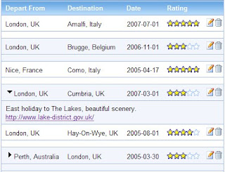
Sign in and start adding your trips on the 'My Travel' tab and watch with barely restrained glee as your global jaunts are plotted automagically. And because a trip worth noting probably has photos, your public, geotagged Picasaweb albums will automagically be added as map markers as soon as you sign in.
But let's face it red string on a poster map is so 1986. Presenting My Travel Map.

Sign in and start adding your trips on the 'My Travel' tab and watch with barely restrained glee as your global jaunts are plotted automagically. And because a trip worth noting probably has photos, your public, geotagged Picasaweb albums will automagically be added as map markers as soon as you sign in.

While you're there you can record the date of each trip, rate it, add a description, and remember a related link.
As you might have come to expect by now, My Travel Map was written entirely using the Google Mashup Editor.
Sign in to My Travel Map and create your own travel map.
Thursday, August 09, 2007
Earthquake! With Damage and Rumble Radii
I visited the Natural History Museum in New York earlier this year and was seriously impressed by the real-time earthquake display. Despite my earnest pleas they cruelly refused to let me take it home with me; instead I stole copied created my own version of their concentric circle filled goodness.
Like the exhibit that inspired it, Worldwide Earthquakes shows not just the epicentres, but also an approximated 'damage zone' (inner circle, dark shading) and 'felt zone' (outer circle, thick border) to give an impression of the areas likely to be affected by each earthquake. Zoom in to see which cities and suburbs will feel the tremor, and which are at risk for property damage.


Red circles show quakes within the last 24 hours, yellow are within the last two days, and grey are everything that's left (up to the last 2 months).
As a bonus, unlike the IRIS/USGS display at the museum, I use multiple data sources to get better world-wide coverage. I include feeds from the Geoscience Australia, the US Geological Survey (USGS), and the European-Mediterranean Seismological Centre.
Big quakes (>5) should be picked up by all the agencies -- but in any case, I've mashed up all three feeds to produce the 'World' tab that shows only earthquakes that people can feel (>3).
Now, if you've got a 30" plasma, you can have you own 'at home' real-time earthquake display. How sweet is that?
UPDATE (10/08/07): Fixed for IE, circles now draw properly in IE (yay!)
Like the exhibit that inspired it, Worldwide Earthquakes shows not just the epicentres, but also an approximated 'damage zone' (inner circle, dark shading) and 'felt zone' (outer circle, thick border) to give an impression of the areas likely to be affected by each earthquake. Zoom in to see which cities and suburbs will feel the tremor, and which are at risk for property damage.


Red circles show quakes within the last 24 hours, yellow are within the last two days, and grey are everything that's left (up to the last 2 months).
As a bonus, unlike the IRIS/USGS display at the museum, I use multiple data sources to get better world-wide coverage. I include feeds from the Geoscience Australia, the US Geological Survey (USGS), and the European-Mediterranean Seismological Centre.
Big quakes (>5) should be picked up by all the agencies -- but in any case, I've mashed up all three feeds to produce the 'World' tab that shows only earthquakes that people can feel (>3).
Now, if you've got a 30" plasma, you can have you own 'at home' real-time earthquake display. How sweet is that?
Note. The Worldwide Earthquake mashup was constructed using Google's Mashup Editor, with additional data processing done using Yahoo Pipes. Read more information on using Pipes to help construct mashups with GME.
UPDATE (10/08/07): Fixed for IE, circles now draw properly in IE (yay!)
Subscribe to:
Comments (Atom)
