
The focus of this week's review is User Experience, so to get some additional insight I've invited my colleague Roman Nurik to co-author it. Roman is passionate about good UI and is pretty handy at pushing pixels, so thanks to him this surgery includes some mockups to illustrate our ideas.
The App: Cycle Hire Widget
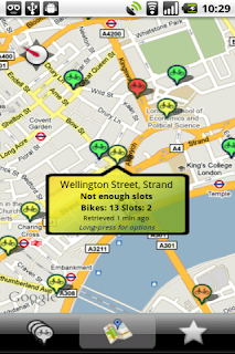
Cycle Hire Widget helps users of London's Barclays Cycle Hire project find nearby docking stations. It shows the distance, direction, and number of bikes / return slots available at each bike depot.
Originally designed only as a widget, CHW has grown into a full app. The widget remains the primary access point, while the app uses a familiar combination of list and map view to display more detailed information on each docking station.
The Deadly Sins and Glorious Virtues
Let's start by taking a look at how Cycle Hire Widget stacks up against the 5 deadly sins and glorious virtues.
Utility
The key to it's success is it's utility. Simple and effective, it solves a particular problem in an elegant way.
Arrogance and Hostility
For the most part the team have conformed to user expectations and respected system preferences. Application settings are presented using native Preference Screens, and long-pressing a docking location displays a context menu.
They've chosen to make the Preference Activity full screen (hiding the status bar) - an option I've
In terms of usability and accessibility, trackball navigation isn't supported. We'd recommend using StateListDrawables to let users navigate the app without using the touchscreen.
Ubiquity and Generosity
The dynamic and interactive widget is a highlight of the app. Live Folders, while not as popular as widgets, could be a useful additional way to show some of the data. It might also be interesting to add a share option to the context menu for each docking station.
I'd love to see the team explore the use of notifications. The (pro version of the) app lets you select favourite depots. It would be awesome if we could monitor those favourites and notify the user if the number of available slots or bikes becomes critical.
Discrimination
The manifest explicitely supports all screen sizes, but the app still seems to be running in compatibility mode. It's important to change the targetSDK to at least 4 so that it can scale appropriately.
Because the app requests permissions for accessing the coarse and fine location, the Market infers a requirement for both WiFi and GPS hardware. Provided you're using Criteria to find suitable location providers, you can then use uses-feature nodes to specify that location services are required, but both of the specific technologies are optional.
<uses-feature android:name="android.hardware.location" android:required="true"/>

<uses-feature android:name="android.hardware.location.network" android:required="false"/>

<uses-feature android:name="android.hardware.location.gps" android:required="false"/>
Sloth and Gluttony
I can see that the Services used to update the location status is short-lived and self-terminating. If they're using inexact repeating Alarms to schedule the updates then we're golden.
The User Experience
This is a great app, and very useful, so the focus of this part of our review is to suggest some ways to add polish to the existing functionality rather than a dramatic change in functionality.
We've created a series of mockups to better illustrate our suggestions - we'll leave it to the Little Fluffy Toys team to decide which (if any!) they want to incorporate. The redesign is based on the principles laid out in Android UI Design Patterns.

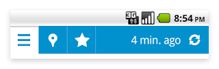
The biggest change is the addition of an Action Bar. As well as providing a consistent theme between Activities, it:
- Replaces the over-sized custom tab panel.
- Lets us refactor the "time since last refreshed" text out of each List View item.
- Has space for a user-initiated refresh icon that can also be used to display an indeterminate progress bar to indicate an update in progress.

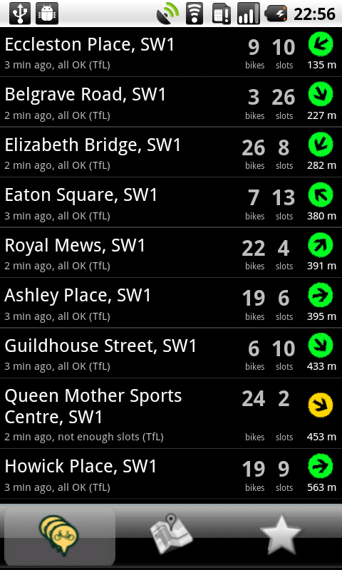
The List View Item layout has been optimized. We've moved the last update text to the action bar, added a toggleable "favourites" star to the left, and we've emphasized the distance over the direction. To make the list easier to parse, we're only displaying the number of bikes and slots for the nearest docking station (or if they aren't enough of either).
The current app doesn't include assets optimized for LDPI or HDPI devices. To prevent fuzzy graphics, you should always create images optimized for each category of screen res. This is especially true of the app icon.
The current lack of menu icons makes the app's menu look half finished. In this instance they can use system defaults for all of them.
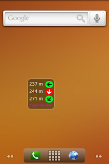
Finally, let's go back to the widget. It's the most visible representation of the app, so we spent a lot of time trying to figure out how to fit the same information in a way that better matched the current native widget style.
We didn't really succeed.
The problem is, that once you take the appropriate spacing into account there just isn't enough room for three distance / direction pairs.

The second shows the three distance / direction pairs, but does so as a full width horizontal bar.
Conclusion
This surgery was a little longer than usual, but hopefully the extra detail on the user experience feedback is a helpful addition. It's up to LFT to decide which of these suggestions are worth the time and effort required to implement. What do you guys think?


As they say in London, oh my days. Great effort guys! So the moral of the story is that the devil is in the detail? I think maybe all developers should start taking a forced week of design consideration on their apps.
ReplyDeleteAmazing job by you two! Wish everyone would invest that detail into user experience on Android.
ReplyDeleteKeep up the good work :)
Nice!
ReplyDeleteRedesign looks beautiful.
ReplyDeleteThe existing UI guide recommends not using a 1x1 widget, but I find them to be quite useful. Especially useful on a crowded home screen.
Its always hard to balance utility and design. Having 3 points on a 1x1 widget sounds more useful but the redesign looks like it would be more fun to use. Hard to say.
Love the redesign!
ReplyDeleteYou mention it should use
ReplyDeleteuses-feature android:name="android.hardware.location.gps"
That "android.hardware.location.gps" string isn't listed in the Android docs - the 'uses-feature' page says "The value must be one of the following accepted strings:" and then fails to list any of the location strings you've mentioned. It's confusing! If I use those undocumented strings will the Market understand it or not? I'm guessing the documentation is out of date.
I find these app surgeries to be incredibly useful. Although it seems rather pointless to preach good practices when the Android documentation goes against you. :)
Thanks for the suggestions guys :) Really love the Action Bar, it would work brilliantly, it's certainly top of the list of things we'll implement. The way you have implemented refresh and favourites are far better than how we did them too. Lots more ideas here for us to digest.
ReplyDeleteGlad (in a schadenfreude way!) that you struggled as we did with the question of widget utility versus design - we fit 9 pieces of information into that 1x1 widget, we're acutely aware that we really have to earn our place on each user's home screen, and I'm unsure whether a 4x1 or indeed any less information in a 1x1 would justify it.
We certainly appreciate the need for graphic designers in any serious application endeavour - but we can never seem to find 'em. If this is you and you're up for the challenge, please get in touch via our website :)
Yet again a great app surgery! I think it is indeed time that app developers are concentrating more on providing a consistent user interface and experience. But to react on Kevin and atla : not every app developerdeveloper is also a ui designer or can afford to hire one. As the developer of a one man open-source project myself, I try to do my best (by adopting the Action Bar for example), but I do not nor will I ever have the capabilities, talent or time to do what Roman and Reto do. Having said that these App Surgeries, open source example projects and clear UI standards greatly help.
ReplyDeleteThanks again for the great review. Still hope you do my app once. :)
Hi,
ReplyDeleteCan you recommend any books on UI design for Android?
Thanks,
Julius.
Good job guys, love the implementation allowing you to say it uses the GPS optionally but is not forced on you. I always use criteria but didn't realise you could reflect this in the manifest.
ReplyDeleteAnd yes wish I could manipulate photoshop like this, WTB UI design skills!
Well thanks for nothing. The app has now incorporated at least one of your suggestions - to replace the "over-sized custom tab panel" at the bottom of the screen, with the "action bar", at the top. This does not improve my experience, it makes it worse. My thumb is at the bottom of the screen, not the top (I'm using it one handed, on a bike, stopped of course). Not impressed.
ReplyDelete1. The suggested widget layout seems to be showing stations 0.4km, 25km, 120km and 299km away. There seems to be some confusion over units here, I presume that the last three are actually in metres and the sorting of the 4 items is faulty the first should be the closest and it's actually the second.
ReplyDelete2. Is the centre of the modified Google Maps pin the bike or the rack? It would be all too easy to get them mixed up. Why not have a more intuitive representation showing a stylised bike and rack?
Amazing redesign, I made similar design choices when working on London Cycle Hire LIVE http://blog.ifuller1.info/?p=110 and http://blog.ifuller1.info/?p=122
ReplyDeleteThanks for the article I like the UI and will definitely use this in future apps as a guideline.
ReplyDeleteOne thing I'd like is a tutorial on how to make android style icons. I'm not a graphics designer but I try to hold my own. Currently, I use tips from iphone icon sites and try to reconcile it to the android icon guidelines. I'm pleased with the results having no real experience with graphics but it's not quite like the android style I want.