Wednesday, March 30, 2011

My Failed Startup (or How I Nearly Become a 3D Animator)

Building awesome software and having the right business contacts is not sufficient to convince the latter to hand over money for the former.
There was a time in 2004/05 when, for several minutes, I thought my future lay not in compilers and debuggers, but in modelers and animation. As you can see, it turns out I don't have the skill, patience, or eye for detail required to transition from "enthusiast" to "someone who gets paid".


The journey that led me to consider adding "animator" to my resume is more interesting than my non-existent animation career. After 6 years writing oil & gas inspection software, I teamed up with a good friend and very smart guy - Big Stu - in a quixotic attempt to extract some serious coin from the bottomless money-pit that is the Western Australian oil & gas industry.

Step 1: Combine his electrical / mechanical engineering knowledge and business contacts with my ninja coding and amateur 3D animation skills to forge a killer app.
Step 2: ???
Step 3: Profit!

Here's our Pièce de résistance:


Our output wasn't Avatar, but the cinematic eye-candy was a side-effect of the tools we used rather than the goal.

We built a system to visualize and simulate anything in a sub-sea installation. Each scene was fully interactive, and the models were based on engineering diagrams and were perfectly accurate. The field layouts were created from sub-sea survey data to perfectly depict every twist and turn of the flow-lines and anchor chains. I've still never heard of a system that provides that level of detail and accuracy for sub sea environments.


Despite the power of the tool and the shiny eye-candy it produced, our venture never gained critical mass and eventually fizzled as Stu and I went our separate ways - Stu as the admiral of a veritable navy of ROVs, and me to London.

What follows is a look back at why a great idea generated zero profit.

Some companies are born of technology, some achieve technological greatness and some have technology thrust upon them

Technology is at the very heart of Google. Any chance to advance the technology of which it was born is seized upon as an opportunity for greater success. It's the philosophy behind our endeavor to "drive the web forward".

Like Google, the oil & gas industry has an absolute dependence on technology. It simply could not exist without an army of technologists creating oil-field prediction engines and well flow models.

Like super-heroes, you can learn a lot about industries from their origin stories

The Social Network and There Will Be Blood both include generous helpings of greed and betrayal, but while getting gypped out of half a billion dollars is a pretty bad day, it's still a significantly better outcome than having your head caved in.

Don't get me wrong, in the 6 years I worked in oil & gas I never once saw anyone beaten to death, so things have progressed significantly in the past hundred years or so. But in it's soul oil & gas isn't about technology; it's a business of hard bastards drilling absurdly deep holes into the earth's crust, praying to f**k it doesn't explode, all in the hope of wringing a few more drops out of the bottom of a rapidly emptying cup.

I drink your milkshake. I drink it up.
(Value of a resource * quantity of resource extracted) - cost of extraction = profit
Finding more of a scarce resource makes it, by definition, less valuable. It's nearly impossible to increase the quality of a natural resource, so the best way to increase profits is to decrease the costs of pulling it out of the ground.

As resources become scarcer, the difficulty (and cost) of locating and extracting said resources increases. At this point your dependence on technology increases, and that technology costs money.

At Google, technology is the product. Our success has come from search and advertising, but technologies like Android, Chrome, and cloud computing offer an opportunity for more success.

In oil & gas, oil & gas is the product - and technology is simply a tool necessary to extract it. This is fundamental, and it affects the way technologists are regarded within each industry.

What they want is fancier tools - not a new cost center.

Stu and I quickly discovered that while there is a bottomless pit of cash, it is allocated almost exclusively to parts of the business that generate revenue.

They will happily pay stupid money for is a shiny box that helps you find oil reserves, or one that lets you extract said nectar from Mother Earth. What they do not want is to pay the salary of a dozen engineers (software or otherwise) that build shiny boxes.

The significant supporting industries - everything from field inspections and environmental surveys to intervention engineering and remedial work - is all just costs. Most have been outsourced and the associated budgets minimized, allocated, and fixed. Entire companies are created through such outsourcing and their goals are to lower costs as far below the allocated budget as possible.

Our technology was about lowering costs - so we should have been golden, right?

The best technology in the world isn't valuable without a customer to sell it to.

The oil companies loved our technology. The shiny graphics are like catnip to executives, and our pitch was compelling:
Using this software, we can increase efficiency by shortening each job by up to 20%. We only charge 5% for using the software, giving you a net saving of 15%.
Big smiles and firm handshakes all 'round.
You need to go speak to Our Contractor. They should definitely be using this!
Next week we bring our roadshow to the Contractor. These guys wear coveralls for a living and recognize the smell of bullshit as it pulls up in the parking lot. They know the animated movies for the smoke and mirrors they are, but they're also engineers - so we switch our focus to the accuracy of our models. So far so good, until we get to the pitch:
Using this software, we can increase efficiency by shortening each job by up to 20%. We only charge 5% for using the software, giving you a net saving of 15%."
The smiles are gone and people are starting to fidget.

Offshore jobs tend to operate on a "daily rate". So our pitch translated into something like this:
Using this software we can shorten your billable days by up to 20% and increase your operational costs by 5%, giving you a net profit reduction of 25%."
Oil Companies outsource technology for a reason, and they're not going to force their contractors to use one particular piece of new, untried technology. The aforementioned contractors have every incentive they need not to use it.

The week-to-week possibility of Croesus wealth punctuated by imminent doom were good practice for later years.

That said, it was a great idea that would likely have succeeded given more time and effort. If I hadn't been in such a hurry to move to London, we could have worked the right deals to get the Oil Companies to convince their contractors to use our tools. It would have continued to be challenging, but it had a good chance. I believe it's inevitable that others will succeed where Stu and I left-off, but in startups - like much in life - timing is everything.

The lessons I learned about business, entrepreneurship, and opportunity have proven invaluable. The pressure and excitement of seemingly imminent success parallel to equally imminent crushing failure was a brutal introduction into the Real World after years spent hiding in the dark corner of my own coding universe. It's strange, but seeing something you pour your heart and soul into fail, can be better incentive to strive than unmitigated success.

I never did persue a career in animation. After taking half a year off to travel Europe I settled in London with my passion for coding reignited. Some four years later, I found a job that offers the perfect mix of business development, technology evangelism, and hardcore coding that plays to my strengths. Oh, and did I mention we're hiring?

Thursday, March 17, 2011

Using the New Android Market Stats for Fun and Profit

Earlier this week the Android Market Publisher site was updated to include some cool new statistics for your apps. You can now see the user distribution of your app in terms of the countries, languages, operating system versions, and devices on which your apps are running.

Better still, you can compare your app's distribution in each of these categories with the overall distribution for all apps in the Market.


What does this mean?

There are two axes for gaining insight from these figures:
  • The distribution of languages, OS versions, devices, and countries of your app users.
  • The variance between your app and the overall (expected) distribution.
I looked at the statistics for my three most popular / successful apps: Earthquake, Animal Translator, and Gyro Compass, and have the following observations, conclusions, and action items.

Action Items and Conclusions
  • Create a Japanese and Spanish translation of Earthquake.
  • Translate Animal Translator into Japanese.
  • Modify culturally sensitive place names for Korean users.
  • Confirm Earthquake works on small-screen devices.
  • Drop platform support for Android 1.5 and 1.6 on Animal Translator.
  • For new apps, it's may not be worth supporting Android 1.5 or 1.6.
  • For new apps, it's worth launching with localized language support for Korean and Japan.
  • When promoting apps, be aware of time-zones.
  • Build tablet-targeted versions now to get first-mover advantage.
Observations: Location and Language
  • All my apps do disproportionately well in the UK. I'm based in London, so it's likely that my tweeting and blogging have driven more people in my time-zone to my apps.
  • The proportion of Japanese and Korean users is effected by how long the app has been around. The older apps have disproportionately more US users and fewer Japanese and Korean users, so  for new apps it's worth building with Japan and Korea in mind at launch. 
  • Japanese users account for 10% of Animal Translator users (double the normal distribution). They clearly like the concept, so a japanese language version should help drive popularity.
  • Around 70% of Earthquake! users are from the US (expected distribution if 60%). This is likely due to a lot of Android users in the San Adreas fault cities of San Francisco and Los Angeles.
  • Earthquake has 1.5% South Korean users versus an average of 10%. Many South Korean users have complained about the USGS use of the name "Sea of Japan" which they believe should be "East Sea". This appears to have a direct impact on their usage of the app.
Observations: OS Versions
  • My apps show a trend where older apps have disproportionately more 1.5 / 1.6 users, and new apps have disproportionately fewer. This seems to suggest that owners of these older devices aren't downloading as many new apps. As a result, it might not be worth supporting 1.5 / 1.6 users for new apps.
  • Earthquake! already has 0.2% of users running Android 3.0. This suggests that building tablet-optimized versions now can give you first-mover advantage.
  • Only 8 people are running Animal Translator on a device running 1.6 or earlier, so I can probably drop support for for < 2.0 in the next update.
Observations: Devices
  • Based on the devices, there are no small-screen Earthquake! users. Does the app work on small screens?
  • The popularity of devices seems heavily affected by the country distribution of users. For my apps the HTC EVO 4G and Droid series of devices seem very popular in the US, with the HTC Desire and Samsung Galaxy S very popular in Korea and Europe.
What patterns did you see?

What observations and patterns did you find looking at your app statistics?

Friday, March 11, 2011

What Does a Magnitude 8.9 Earthquake Look Like?

Today Japan was struck by a massive 8.9 magnitude earthquake that caused major damage and loss of life. The quake hit off the coast which resulted in a tsunami which struck towns along the Northern coast of Japan and has resulted in tsunami alerts across the Pacific including as far away as the West coast of the US and Australia.

Seismological details on the quake are available from the Japan Meteorological Society and the US Geological Survey.

If you have friends or family in Japan, or you're in Japan and want to let people know you're ok, you can use the Google Person Finder

Aljazeera are streaming live coverage on YouTube.

In very real terms, these pictures from The Atlantic show exactly what an 8.9 magnitude earthquake looks like. My thoughts go out to everyone affected.

Some Visualizations

A magnitude of 8.9 is big. Very big.

The Richter scale is logarithmic, meaning an increment each whole number increase in magnitude represents a tenfold increase in measured amplitude. In real terms, that makes today's earthquake in Japan is around 500 times more powerful than the 6.3 magnitude quake that devastated Christchurch in New Zealand last month.
The following visualizations are screen captures from my Earthquake Android app. They attempt to give an idea of the scale (relative and otherwise) of the earthquake in Japan. They are approximate, using only the magnitude of the quake to determine the areas likely to be affected. Additional factors like depth of quake, fault lines, mountains, and landscape can significantly change the areas affected.
In the image below, the giant outer circle represents the area within which people were likely to have "felt something"during the quake. That's the better part of a hemisphere reaching as far as Brisbane in Australia and touching Alaska.

By comparison, the smaller inner circle is the same "felt" area for a 7.1 magnitude aftershock.


This next image represents the area at significant risk of suffering from structural damage due to the quake. Again, the larger circle represents the initial 8.9 magnitude quake and covers around three quarters of Japan - an area that represents most of the US West coast.

For comparison, the smaller circle centered around the 7.1 marker is the damage radius for the smaller aftershock.


Just as striking is the aftershocks that inevitably follow such a significant quake. The following image shows only the aftershocks measuring above 6 ("Strong: Can be destructive in areas up to about 160 kilometers") on the Richter Scale.


The overlapping areas all occurred within two hours of each other and give a sense of just how terrifying it must be for the people affected.

My hopes and best wishes go out to everyone affected by this catastrophe.

Monday, March 07, 2011

The Rise of the Tablet and the Innevitable Death of the Netbook

Last week I added a 10.1" Motorola Xoom to my gadget bag at the expense of a Netbook. As tablets grow in popularity I predict the Netbook's days are numbered.

Shortly after buying an Asus EeePC 701 in 2008 I described it to anyone who would listen as the best technology purchasing decision I'd ever made. It cost £200, was thin, light, and cheap. It booted Windows and loaded Office in under 10 seconds - only the paltry 800x600 display resolution was a legitimate cause of grief.

I used it to write most of my first book during my daily commute, and it was light and thin enough for me to throw in my bag for holidays or trips where I wasn't keen on bringing my laptop along (at the time my laptop was as 17" Vaio desktop replacement that weighed the better part of a metric fucktonne).

Light and with a full-day battery life,  Netbooks were a cheap second computer for lightweight computing tasks and surfing the web.

A one trick pony

Growing up, my parents ran a typewriter sales and repair company. I watched as the typewriter was gradually (and then very quickly) replaced with the desktop computer. For a small while "word processors" were a popular alternative - significantly cheaper than computers, and with most of the features of Word Perfect 5.1.

As PCs, laptops, and printers become cheap and ubiquitous, word processors grew more fanciful in an effort to compete. They offered more fonts and options but at a higher price. Before long, like most one-trick ponies, it was quietly covered with a sheet and put out of its misery.

I had a distinct feeling of deju-vu when late last year  I went in search of a replacement for my EeePC in the hopes of finding something cheaper, lighter, and a little faster. Instead I was presented with devices that were:
  • More expensive.
  • Thicker and heavier.
  • Slower to load and lacking SSDs.
At the same time, my new Macbook weighs around two kilograms and is no more than an inch thick. I can use it to write my book, write my code, edit photos, and pretty much anything else I could want to do.

It's true that a MBP is a lot more expensive than a Netbook - and bulkier - but it's not as though you would buy a Netbook instead of a real laptop. It's an additional device, so it's actually competing with tablets or smartphones - and a smartphone / tablet combo has a lot more to offer.

Smartphones and tablets make Netbooks a quaint irrelevancy

Modern smartphones, led by iPhone and Android, have largely filled the niche of mobile web browsing.

The arrival of the tablet is the final nail in the coffin, with a 10" tablet neatly filling the gap between smartphone and laptop.

With bright, high resolution displays, tablets offer an unparalleled experience for watching video. Games designed for tablets are created specifically for portable hardware featuring a touch screens and accelerometers. Similarly the rich ecosystem of apps is optimized specifically for smartphone and tablet platforms.

Typing on a 10.1" touchscreen is certainly no worse than typing on an undersized Netbook keyboard. Walking into meetings these days I'm increasingly finding people have left their laptops behind and are instead bringing along their tablets.

If you need to type, bring a laptop. If weight is an issue, bring your tablet

Tablets provide an optimized experience for portability, mobility, and touch-based input with a rich selection of apps and games designed with their size and power in mind.

Laptops are cheaper, lighter, and more powerful than ever before. They offer a rich ecosystem of apps and provide the perfect platform where text input is required.

Netbooks can still provide a great platform for getting online, but so can laptops and tablets. Laptops may one day give way to tablets and smartphones entirely, and apps may move entirely online, but Netbooks - like word processors in the 80's - will inevitably fall victim to competitors that offer a more dynamic ecosystem of apps, games, and features at an increasingly comparable price.

Monday, February 21, 2011

Mobile World Congress: Slides, Smoothies, Collectable Pins, and Gadgets Galore

On the scale on which these things are measured, Mobile World Congress doesn't have a reputation for being a "fun" event. Exciting, vibrant, interesting, and worthwhile - sure. But the number of suits and ties in attendance generally precludes the sort of party atmosphere people expect at events like SXSW or Google I/O.

Less fun, that is, until now

It turns out that if you want to see serious folks in serious suits take a ride down a slide all you need to do is build it: and they will come.

By 9:30 on Monday morning the pristine environment of the Android stand - tucked away in a corner of Hall 8 - was a heaving mass of developers, CEOs, reporters, and collectable pin enthusiasts.


The Android stand (here's some more pictures) at MWC was all about openness and inclusion. The highlight for me was the 40 or so 3rd party developers who (rightly) stole the show. They worked tirelessly, demonstrating their apps and showcasing just what's possible on the Android platform. Developers take note: this could be you next year.

Typically at MWC Tuesday is the busiest day, with Wednesday tapering off and Thursday seeing the halls empty and abandoned by midday. Not this year. The stand was packed every day from 9:00 when they opened the gates to 7 when they flashed the lights. Even on Thursday when most stands are rolling up the carpet after lunch, we had a full house until the lights went off at 4pm.


Android Gurus, 3rd party developers, and a device bar with over 80 different Android powered handsets kept the crowd entertained. The obligatory slide was in constant use, and free smoothies (the Honeycomb - flavored with honey and lychee - was my pick) were on offer served by a bevy of friendly antipodean bartenders, who towards the end of the event served as the kingpins of a roaring trade in collectable Android pins.

Have you got any pins?

So it turns out that all you need to transform a clean-cut three-piece-suited CEO into a screaming fanboi is the introduction of limited edition Android collectable pins.

What started as a curiosity on day one exploded into full-blown pin-mania by Tuesday. There were 86 of these on offer at MWC - here's a few of my favorites.


Of course what we're really here for is the gadgets

And we weren't disappointed. There were some great new handsets on display this year, including LG's fascinating Optimus 3D features a 3D display that doesn't require special glasses.

The Samsung stand was a gold mine of awesome sauce with the frankly stunning Galaxy S II and the Honeycomb-sporting Galaxy Tab 10.1 tablet. As usual the screens on these devices where gorgeous - and the 10.1" Galaxy Tab was surprisingly light - I'd like to spend a little more time with both.

Tablets were the big news of the show, with the Samsung Tab 10.1 and the LG G-Slate joining the Motorola Xoom as forthcoming tablet devices running Android Honeycomb. HTC's also announced their first Android tablet (the HTC Flyer), a 7" tablet that will apparently run Gingerbread before receiving an OTA update to bring it up to Honeycomb.

I'm a fan of HTC's industrial design, so I'm excited to see what they come up with in the tablet market.

A+++ Would attend again

Any trip to Barcelona means great food and plentiful drink and this visit was no exception.

While in Barcelona I had the great pleasure of hanging out with the folks who make up the Barcelona GTUG. These guys are as awesome as they are welcoming. MWC is famous for its extravagant parties but hanging out with these guys in a crowded local bar was a definite highlight.

Between the fun of the Android stand, the excitement of getting to play with new toys, and the gluttonous pleasure of Spanish cuisine it was an incredible experience. The only question now is how do we top it next year?

Only time will tell, but I saw the designers behind this year's stand sketching plans for a two story slide...

Wednesday, February 09, 2011

Strategies for Honeycomb and Backwards Compatibility

Each new Android release heralds two things: A raft of new developer APIs, and a chorus of questions on how to use them while staying backwards compatible.

Android 3.0 (Honeycomb) is notable in that it introduces Fragments, possibly the most fundamental change to how Activity UIs are constructed since Android 1.0. To add to the excitement, Honeycomb is also the first Android platform release optimized specifically for extra-large screen (tablet) devices.

The good news is that we plan to have the same fragment APIs available as a static library for use with older versions of Android; the plan is to go right back to 1.6.

The easiest short-term fix is to create separate sets of Activities
When the static Fragments library becomes available you'll be able to skip this step entirely (or simply deprecate these Activities from your application). 
The introduction of Fragments (and to a lesser degree the Action Bar) represents a significant change to the code the lives within your Activity classes.

The following technique demonstrates how you can  create two separate sets of Activities: one set that supports Fragments and another set that is designed to work without them.

To select the right set of Activities at runtime, you need to include a launcher Activity in your manifest that detects support (or lack thereof) for Fragments and then starts the appropriate Activity.

<activity
  android:name="InitialActivity"
  android:label="@string/app_name">
  <intent-filter>
    <action android:name="android.intent.action.MAIN" />
    <category android:name="android.intent.category.LAUNCHER" />
  </intent-filter>
</activity>


Within InitialActivity, you can use reflection to check if Fragments are supported on the current device.

  private static boolean fragmentsSupported = false;

  private static void checkFragmentsSupported() throws NoClassDefFoundError {
    fragmentsSupported = android.app.Fragment.class != null;
  }

  static {
    try {
      checkFragmentsSupported();
    } catch (NoClassDefFoundError e) {
      fragmentsSupported = false;
    }
  }


Then within onCreate forward the application to the "real" first Activity that either uses Fragments or not depending on the capabilities of the device.

  @Override
  public void onCreate(Bundle savedInstanceState) {
    super.onCreate(savedInstanceState);

    Intent startActivityIntent = null;
    if (!fragmentsSupported)
      startActivityIntent = new Intent(this, MainNonFragmentActivity.class);
    else
      startActivityIntent = new Intent(this, MainFragmentActivity.class);

    startActivity(startActivityIntent);
    finish();
  }
}


Because you're calling finish immediately after starting the new Activity, the back button behaviour of your application works as expected.

Within the MainNonFragmentActivity you simply inflate a layout resource that doesn't use Fragments

setContentView(R.layout.non_fragment_main);

While the MainFragmentActivity inflates a layout that does.

What about the rest of the Honeycomb APIs?

The upcoming static Fragment library means you probably won't need to implement the previous technique in order to use Fragments as the building blocks of your UI, but what about the other new Honeycomb APIs like the Action Bar and Animators?

Let's ignore the non-Fragment Activities and focus on the scenario where Fragments are available, but none of the other Honeycomb APIs are.

The first step is to determine the availability of the new APIs. You can implement the same exception catching technique I used above for each of the classes you wish to use, but I've found it simpler to bundle all the new APIs together and build only two variations:

  private static boolean shinyNewAPIsSupported = 
    android.os.Build.VERSION.SDK_INT > 10;

Maintaining two sets of Activities doesn't require a parallel set of Fragments, layouts and resources

Once again, I'm going to create a parallel set of Activities: One that uses the shiny new APIs like the Action Bar and animations, and another that uses traditional techniques to create a similar user experience.

The technique described above can be used in the same way - this time using the shinyNewAPIsSupported variable to determine which Activity to start.

Because most of the user-interface logic is contained within the Fragments rather than the Activity, these parallel Activities don't do much beyond inflate slightly different layouts. Where the Action Bar is available the Activity will handle the effect of navigation and action clicks. If the Action Bar isn't available, the layout used will likely incorporate a custom version that mimics its behavior.

Only the highlighted ActionBarFragment in the following snippet would be different between the pre- and post-Honeycomb app layout.

<LinearLayout xmlns:android="http://schemas.android.com/apk/res/android"
  android:orientation="vertical"
  android:layout_width="fill_parent"
  android:layout_height="fill_parent">
  <fragment class="com.paad.hc_backwards.ActionBarFragment"
    android:layout_width="fill_parent" 
    android:layout_height="wrap_content"/> 
  <LinearLayout
    android:layout_width="fill_parent"
    android:layout_height="fill_parent">
    <fragment class="com.paad.hc_backwards.SelectionFragment"
      android:layout_weight="3"
      android:layout_width="fill_parent"
      android:layout_height="fill_parent"/>
    <fragment class="com.paad.hc_backwards.ContentFragment"
      android:layout_weight="1"
      android:layout_width="fill_parent"
      android:layout_height="fill_parent"/>
  </LinearLayout>
</LinearLayout>


The key is that both sets of Activities will use the same fragments. Interaction between and within Fragments is usually maintained within each fragment, so only code related to the Action Bar (and other missing APIs) will need to be changed within the two Activity sets.

I expect all the apps I use on my phone to be optimized for tablets

Now lets take a look at the changes inherent in the introduction of the extra-large display. Fragments are designed specifically to make it easier to create flexible layouts, so I'm going to assume the existence of either Honeycomb or the static Fragment library when considering our options.

Device independent pixels (dp) and flexible layouts (like Relative Layout and Linear Layout) let your app scale to the dimensions and orientation of tablets. However, an app running on a 10" landscape device 1280 pixels across has a hell of a lot of whitespace when it was designed for a 4" portrait display at 480 pixels.

Consider the typical app design pattern where making a selection on one Activity determines what content is displayed another. Making a selection hides the selection Activity and displays the selected content.

Using Fragments you can easily construct layout variations for different screens

On a tablet it makes sense to position the selection and content Fragments within a single Activity, while on a phone only one should be visible at a time.

You can handle this as we did pre-Honeycomb by creating a res/layout-xlarge resource folder into which we put the side-by-side layout to use on an extra-large (tablet display).

<LinearLayout xmlns:android="http://schemas.android.com/apk/res/android"
  android:layout_width="fill_parent"
  android:layout_height="fill_parent">
  <fragment class="com.paad.hc_backwards.SelectionFragment"
    android:id="@+id/selection_fragment"
    android:layout_weight="3"
    android:layout_width="fill_parent"
    android:layout_height="fill_parent"
  />
  <fragment class="com.paad.hc_backwards.ContentFragment"
    android:id="@+id/content_fragment"
    android:layout_weight="1"
    android:layout_width="fill_parent"
    android:layout_height="fill_parent">
  </fragment>
</LinearLayout>


In practice, we'll usually want to define a portrait and landscape specific mode using port or land resource qualifiers:

res/layout-xlarge-port
res/layout-xlarge-land

For phones, we'll use the same Fragments, but the layout (stored in res/layout) would contain only one Fragment stored in a containing layout.

<FrameLayout xmlns:android="http://schemas.android.com/apk/res/android"
  android:id="@+id/selection_fragment_frame"
  android:layout_width="fill_parent"
  android:layout_height="fill_parent">
  <fragment class="com.paad.hc_backwards.SelectionFragment"
    android:id="@+id/selection_fragment"
    android:tag="full_screen_fragment"
    android:layout_width="fill_parent"
    android:layout_height="fill_parent"
  />
</FrameLayout>


Within our code this produces a dilemma

The selection and content Fragments will interact slightly differently in phone or tablet mode. In both cases, making a selection should be reflected in the content Fragment - however in the phone layout this should also replace the selection Fragment with the newly updated content Fragment.

public void makeSelection(int i) {
  boolean extraLargeScreen = getResources().getConfiguration().screenLayout >
                            Configuration.SCREENLAYOUT_SIZE_LARGE;
  if (!extraLargeScreen) {
    FragmentTransaction ft = fragmentManager.beginTransaction();
    ft.hide(selectionFragment);
    ft.add(R.id.selection_fragment_frame, contentFragment);
    ft.addToBackStack(null);
    ft.commit();
  }
  contentFragment.setSelection(i);
}


Note that by calling addToBackStack we ensure that pressing the back button will undo this transaction, hiding the content Fragment and displaying the selection Fragment.

Fragments are a great way to componetize your UI

The new Android 3.0 (Honeycomb) SDK introduces a number of great new APIS, many of them designed to make it easier to build tablet version of your apps by providing a flexible mechanism for building different layouts depending on screen size and orientation. The availability of a static Fragment library will simplify the process of creating flexible layouts that are backwards compatible.

It is my firm belief that any app developed for mobile should be available for tablets. When I put my credentials into a shiny new tablet, I expect it to install all the apps I use on my phone - and I expect all of them to be optimized for the tablet form factor.

That's not to say you shouldn't create apps that are designed to work only on tablets, but I believe these tablet-specific editions should be made available side-by-side with phone versions that have been optimized to work on tablets.

Wednesday, February 02, 2011

Android Web Market, In App Billing, and Buyer Currency

Today during the Android Honeycomb Event we launched a couple of really exciting new features Android. As well as a closer look at what's possible with the Honeycomb SDK, we also announced:
There's more details on all three at the Android Developer Blog, and you can watch the launch event on YouTube.

Web Based Android Market

This is long awaited and seriously cool. Finally we developers have a homepage on the web for our Android apps. Not only that, but now we can install apps OTA simply by pressing install and the app of our choice will be automagically pushed to our phone.

My question to you: Have you uploaded the 512x512 alpha blended app icon and 1024x500 full bleed feature graphic? If the answer is no, then you have (at best) a 72x72 icon stretched into jaggy hell representing your app to would be users. That's probably something you want to do something about sooner rather than later.

To celebrate web landing pages for apps I've put together this list of the apps that I've been using on my Android devices.

Buyer Currency Support

You can now specify different prices for different currencies - and even more importantly, as a result users will always see the app priced in their local currency. No more "~" symbols or strange foreign currencies.

In App Billing

More ways for developers to monetize their apps can only be a good thing. A simpler purchase process for users benefits everyone.

Tuesday, February 01, 2011

Android App Surgery: Earthquake Redux (Honeycomb Tablet Edition)

If you follow me on Twitter you'll know I spent a great deal of the week before last firmly in The Zone, lost in the joyful exuberance of writing code. What I was working on? I was exploring the many and varied Android 3.0 (Honeycomb) SDK APIs.

To celebrate the Honeycomb preview SDK I'm doing an Android App Surgery that explores how I modified my existing Earthquake phone app for Honeycomb tablet devices. If you're interested in seeing more of these, nominate an app for review!


The App: Earthquake! (Tablet Edition)

I've taken the tablet redesign as an opportunity to implement many of the ideas that came up during my original Earthquake App Surgery. Chief amongst them was to improve the user experience, so I enlisted my colleague Roman Nurik to help me create a more polished design.


As well as a tasteful and distinctive red and white theme, this new UI style incorporates the Action Bar design pattern that simplifies navigation and highlights the refresh action. Small touches like the Level List Drawables used to indicate the relative size of each quake, the improved layout of each List View Item, and the introduction of the detail view work together to produce an app the is far more polished and intuitive.

Here's something I prepared earlier


The tablet design incorporates the distinctive new theme and List View Item layout, while the extra screen size lets me pull all three Activities (map, list, and details) into a single layout using Fragments.  In Honeycomb the Action Bar is a standard application component; I've customized it to use my theme and support my preferred navigation style and common actions.

 The defining feature of the tablet is its extra large screen
...or how I learned to stop worrying and love Fragments

The most pressing issue for most developers will be making effective use of an extra-large display. Fragments let you structure your Activities into separate interacting components.

You can easily rearrange, replace, show, and hide individual Fragments based on screen size, orientation, or user interaction. This is really useful for designing apps to support different screen sizes, or creating different layouts for portrait versus landscape.


Each Fragment encapsulates a piece of application UI and the associated functionality. Like Activities, the visual layout for each Fragment is defined in layout XML files. Typically the Activity layouts for landscape, portrait, and different screen sizes simply rearrange how the same Fragments are laid out.

I've used three Fragments plus the Action Bar. One to display the list of earthquakes, another to show the map, and a third to display the selected details.
For many tablet devices landscape will be the default orientation, so my primary design for Earthquake is landscape, but it's important to also create a compelling portrait mode.
Like Activities, each Fragment has its own lifecycle. You use the life cycle events to to save state and connect/disconnect listeners and receivers just as you used to do within Activities.

Each fragment can access its parent Activity by calling getActivity, and each Activity can find any of its Fragments with findFragmentById. This lets Fragments interact with each other regardless of their visibility or how they're laid out within an Activity.

Fragment Transactions let you modify the screen layout in real-time in response to user actions

You can show, hide, or replace individual Fragments at run time to create dynamic, interactive displays. In Earthquake I use Fragment Transactions to replace the details Fragment whenever a new quake is selected, and to hide the list and details fragments when the app switches to full screen.

FragmentTransaction ft = getFragmentManager().beginTransaction();
ft.hide(listFragment);
ft.commit();


The Fragment framework also lets you set breadcrumbs as you show, hide, or replace Fragments that allow cause the back button to revert the last transaction. In many cases your application will now contain a single Activity with a number of Fragments that are displayed, hidden, or replaced based on user navigation.
In Earthquake, for example, the normal (phone sized) UI layout would have a single Activity with the list Fragment visible at launch. Clicking a quake would replace the list with the with this transaction being added to the back stack so that a user pressing back returns then to the list view. I'd probably also use Tab Navigation in the Action Bar to let users switch between the map and list views.
The New Navigation: Introducing the Action Bar

The Action Bar component is a navigation panel that replaces the old title bar at the top of every Activity which neatly formalizes the emerging "Action Bar" design pattern. It's possible to hide the Action Bar, but best practice is to keep it and customize it to suit the style and navigation requirements of your app.


I started by applying a custom gradient to the background.

final ActionBar ab = getActionBar();
final Resources r = getResources();
final Drawable myDrawable = r.getDrawable(R.drawable.gradient_header);
ab.setBackgroundDrawable(myDrawable);


Next is navigation. There's a number of options for navigating your application - the two most common are tabs and drop down lists. I've used a drop down so users can choose the minimum magnitude of quakes to display. I might add a second drop down to also view quakes based on distance.

Here's how I create the drop down list and set the navigation mode on the Action Bar to display the drop down list.

ArrayAdapter mSpinnerAdapter;
mSpinnerAdapter = ArrayAdapter.createFromResource(this,
  R.array.magnitude_options,
  android.R.layout.simple_list_item_multiple_choice);
ab.setListNavigationCallbacks(mSpinnerAdapter, mOnNavigationListener);

ab.setNavigationMode(ActionBar.NAVIGATION_MODE_DROPDOWN_LIST);


The standard menu button has been deprecated in Honeycomb, in it's place is the on-screen menu icon at the far right of the Action Bar. The icons to its left are Menu Items that represent common actions.

To make them appear as Action Bar icons, you just flag them as SHOW_AS_ACTION, SHOW_AS_IF_SPACE, or SHOW_AS_ACTION_WITH_TEXT which will make their icons visible, visible only if there is enough space, and/or with the menu text visible respectively.

fullScreenMenuItem.setShowAsAction(MenuItem.SHOW_AS_ACTION_ALWAYS);

Animations that are smooth like butter

One of my favourite Honeycomb APIs is the new Animation framework. It boldly promises nothing less than the ability to animate any property on any object, and it delivers on that promise spectacularly.

The original idea for Earthquake was based on an inspiring exhibit at the New York Natural History Museum. It used animated expanding circles to dramatically illustrate the size and location of earthquakes and their relative timing.

I can now achieve the same effect by creating an Object Animator that animates the Image Level property of the Scale Drawable objects used to illustrate the felt radius of each quake.

final ObjectAnimator oa = new ObjectAnimator();
oa.setDuration(3*1000);
oa.setIntValues(0, 10000);
oa.setTarget(eachExandingCircle);
oa.setPropertyName("ImageLevel");
oa.start();


The silky smooth transition in and out of full-screen mode is also animated using an Object Animator. This time I'm animating the Layout Parameters of the Activity layout to adjust the relative weight of the list and map Fragments.

The animated transitions between detail Fragments are managed by a Fragment Transaction. I simply specify the fragment to replace, what to replace it with, and what animation to use for the transition.

DetailsFragment newFragment = DetailsFragment.newInstance(quake_id);
FragmentTransaction ft = getFragmentManager().beginTransaction();
ft.setCustomAnimations(R.anim.slide_in_left, R.anim.slide_out_right);
ft.replace(R.id.details_fragment_container, newFragment, "detailFragment");
ft.commit();

Still to do...

I'm pretty happy with the styling and user experience so far, the next step is to incorporate the significant improvements to the Widget and Notification APIs.

Before launch I'll create a new list-based widget of recent quakes and an enhanced notification layout.

Get Your App Reviewed!

If you'd like to see how your app might look and work on a Honeycomb tablet, you can self-nominate at the moderator site. You can also go there to vote for which app you'd like to see reviewed! If you've got questions about developing for Honeycomb, head to StackOverflow and mark your questions with the Android and Honeycomb tags.

Monday, January 10, 2011

How To: Use the Gyroscope API and Remain Android 1.1 Compatible

Making your app backwards compatible is the process of ensuring it degrades gracefully. 

Every new Android SDK release introduces a variety of new APIs

It takes time for each new OS version to percolate through the ecosystem, so while new functionality is cool, but it introduces a dilemma - use the new hotness or support the majority of users?

The answer of course is to do both! Make use of useful new APIs where they're available, and fall back to an earlier alternative (or disable functionality) when necessary.

Let's look at a practical example
My Nexus S has a gyroscope sensor that I can use to stabilize my artificial horizon / compass app (New Horizons). I'll save most of the implementation details for a separate post, and focus instead on how I can adjust my code to go from supporting only Android 2.3, to supporting everything from Android 1.0 up.
The platform version distribution shows 99.9% of devices are now running at least Android 1.5, and more than 75% are running 2.1+, so in this case achieving 1.0 compatibility is a contrivance that lets me demonstrate a number of useful techniques within a single example.
I'll start by reacting to orientation changes using the gyroscope in 2.3 and then remove hardware and API features until we end up compatible with a factory-fresh HTC G1.

Using the gyroscope sensor 

You'll need code that looks a little like this:

private void hookupSensorListener() {
  SensorManager sm = (SensorManager)getSystemService(Context.SENSOR_SERVICE);
  sm.registerListener(sel,
    sm.getDefaultSensor(Sensor.TYPE_GYROSCOPE),
    SensorManager.SENSOR_DELAY_UI);
}

private final SensorEventListener sel = new SensorEventListener() {
  public void onSensorChanged(SensorEvent event) {
    if (event.sensor.getType() == Sensor.TYPE_GYROSCOPE) {
      updateOrientation(event.values[0], event.values[1], event.values[2]);
    }
  }
  
  public void onAccuracyChanged(Sensor sensor, int accuracy) {}
};

private void updateOrientation(float heading, float pitch, float roll) {
  // Update the UI
}


Within the updateOrientation method you react to each orientation change (for a gyro that's going to mean integrating the changes in angular velocity) and eventually extract values you'll use to update the UI.

Case 1: What if there is no gyroscope?

Can we implement the same functionality with different hardware? In this case yes, we can use the accelerometers to determine our orientation.

Start by creating a listener interface that can listen for orientation changes:

public interface OrientationChangeListener {
  public void onUpdate(float heading, float pitch, float roll);
  public void onAccuraryChanged(int accuracy);
}


Then define another interface that can be implemented to handle orientation updates from different sensor hardware:

public interface IOrientationSensorListener {
  public void setOrientationChangeListener(OrientationChangeListener l);
  public void registerListener(SensorManager sensorManager);
  public void unregisterListener(SensorManager sensorManager);
}


Create two implementations of the IOrientationSensorListener class, one that uses the gyro and the other that uses accelerometers:
  • GyroOrientationSensorListener
  • AccOrientationSensorListener
The orientation updates are encapsulated in their hardware-specific implementations, so we need to implement an OrientationChangeListener that will receive their orientation updates and update the UI accordingly:

final OrientationChangeListener ocl = new OrientationChangeListener() {
  public void onUpdate(float heading, float pitch, float roll,) {
    updateOrientation(heading, pitch, roll);
  }

  public void onAccuraryChanged(int accuracy) {
    updateAccuracy(accuracy);
  }
});


Now we determine if the gyro is available:

PackageManager paM = getPackageManager();
boolean gyroExists = paM.hasSystemFeature(PackageManager.FEATURE_SENSOR_GYROSCOPE);


And instantiate the appropriate IOrientationSensorListener implementation:

IOrientationSensorListener mySensorListener;
if (gyroExists)
  mySensorListener = new GyroOrientationSensorListener();
else
  mySensorListener = new AccOrientationSensorListener();


Before hooking up the orientation change listener:

mySensorListener.setOrientationChangeListener(ocl);
For cases where there is no viable alternative hardware, you can either disable that functionality completely, or specify the required hardware as a mandatory feature:

<uses-feature android:name="android.hardware.sensor.gyroscope"/>

Note that this will prevent your app from being visible on the Market for devices without the required hardware.

Case 2: What if the APIs you're using are missing?

While your Android 2.3 app will install and run on any version of the Android OS, it will crash the moment it tries to use a class or method that doesn't exist on that device. To figure out what needs to be fixed, you can modify your project's build target to the lowest OS version you intend to support and see what won't compile.

Looking at my code above, I can see the following constants, methods, and classes were introduced since Android 1.0:
  • API Level 9: PackageManager.FEATURE_SENSOR_GYROSCOPE
  • API Level 6: PackageManager.hasSystemFeature()
  • API Level 3: Sensor, SensorEvent, and SensorEventListener
Dealing with new constants

New constants will work without any changes. The compiler will convert them into the value they represent and the methods into which you pass them should be able to handle with unrecognized values cleanly.

In this instance I pass a string constant into the hasSystemFeature method that assumes any feature it doesn't recognize isn't available and returns false.

We're now compatible with API Level 6 (Android 2.0.1)!

Dealing with missing methods

Missing methods are a little more complicated. In this case the PackageManager class has been extended to include the hasSystemFeature method. If you call this method on a device running Android 1.6 (or below) it will throw an exception and crash.

To avoid this you can:
  • Use reflection at runtime to determine if the method exists.
  • Replace the method with an alternative that works on previous OS versions.
Reflection is expensive, so first we'll check if there's a cheaper alternative that doesn't add significant complexity or cost.

In this case I can use SensorManager.getDefaultSensor to check if there is a default gyroscope sensor available.

boolean gyroExists = sensorManager.getDefaultSensor(Sensor.TYPE_GYROSCOPE) != null;

We're now compatible with API Level 3 (Android 1.5), and given the distribution of Android OS versions in the wild, for most cases we'd be done.

We still haven't looked at dealing with missing classes though, so for the sake of completeness let's go one step further and ensure support for Android 1.0.

Dealing with missing classes

The Sensor, SensorEvent, and SensorEventListener classes were all added in Android 1.5 (along with a number of useful SensorManager methods including getDefaultSensor used above).

Let's start by using reflection to see if the new Sensor classes and methods are available. This can be expensive so it's important to perform the check only once per application launch. We'll also assume that the existence of one 1.5+ class implies the existence of the rest.

private static boolean sensorListenerExists = false;
 
private static void checkSensorEventListenerExists() throws NoClassDefFoundError {
  sensorEventListenerExists = SensorEventListener.class != null;
}
 
static {
  try {
    checkSensorEventListenerExists();
  } catch (NoClassDefFoundError e) {
    sensorEventListenerExists = false;
  }
}


To avoid an exception on calling getDefaultSensor we need to move this call into a new class that's only used if the new method is available. Let's expose the functionality using a static method to avoid the need to create any new objects:

public class SensorEventHasGyro {
  public static boolean gyroExists(SensorManager sensorManager) {
    return sensorManager.getDefaultSensor(Sensor.TYPE_GYROSCOPE) != null;
  }
}


Gyroscopes weren't supported prior to Android 1.5, so we can check for a gyroscope sensor using the following code:

boolean gyroExists = sensorListenerExists && 
                     SensorEventHasGyro.gyroExists(sensorManager);

Finally, we create a new implementation of the OrientationSensorListener that uses the old technique for calculating orientation from accelerometers (which is so deprecated it's not worth repeating here), then modify the code used to select and instantiate the correct implementation.

if (gyroExists)
  mySensorListener = new GyroOrientationSensorListener();
else if (sensorListenerExists)
  mySensorListener = new AccOrientationSensorListener();
else 
  mySensorListener = new AccOldOrientationSensorListener();

Summary

While providing support for Android 1.0 as done in this example is a little contrived, the same techniques will work in cases like the Download Manager or SIP stack where the majority of users don't have access to the newer versions of the OS.

Why wait until everyone is using Android 2.3 to make use of the gyroscope or download manager? Using these techniques you can build it in right now, and simply provide an alternative implementation for users who aren't fortunate enough to have the latest hardware / software.

Monday, January 03, 2011

Listomania! My Reading List and Gadget Compendium

tl;dr

Those of you interested can check out these lists of what I've been reading and what gadgets I'm using (and have used).

The Long Version

My Reading List

One of my resolutions for 2010 was to read at least one book every two weeks. Having kept track of everything I read, I figured I might as well share it - hence Reto Meier's Reading List. Some observations from reviewing the list:
  • Favourite Book: Music for Torching by A. M. Holmes.
  • Most Read Author: Philip K Dick accounted for 4 of the 23 books I read in 2010.
  • The Kindle Effect: I read 6 books in 2 months on Kindle versus 17 in the 9 months before.
  • Hardcover versus Paperback: 12 hardcovers, 6 eBooks, 5 paperbacks.
I'll continue to update this with new books as I read them -- hopefully at a rate of one every two weeks.

My Gadget Compendium

I often get asked which gadgets (Android powered or otherwise) I'm currently carrying around. These days the list seems to change every month or so, so for easy reference I've put together Reto Meier's Gadget Compendium.

I'll update it whenever a new gadget gets slightly less top secret, or something gets retired from the active lineup. A couple of observations from looking at my current lineup and the honorably discharged:
  • Rate of Innovation: From 2 phones in 5 years, to 5 phones in two years since the G1 was released in 2008.
  • Size: Everything (except my Netbook) has gotten thinner, lighter, and sleeker. There's also a distinct movement away from physical keys / buttons -- my SE P910i had a qwerty keyboard, dial pad, and a 5 function scroll wheel, my Nexus S and Galaxy Tab have only power and volume keys.
  • Connectivity: The only pieces of old kit with a mobile data connection where the phones. Now the only gadget in my bag without 3G is my camera. Which reminds me, I must pick up an Eye-Fi card.
With a broader variety of Android devices scheduled for release this year it'll be interesting to see if they replace or augment my existing collection of portable gadgets. I'd love to replace the netbook for a Chrome-powered variety, but I'm not sure I can imagine writing a whole book without Word so I'm not sure if that's on the cards.

Thursday, November 25, 2010

No. Sleep. 'Til Stockholm!

Ten events in seven cities across six countries in twenty-two days.

The slides for "Being Epic: Best Practices for Android Development" are on SlideShare, and you can see me presenting them at GDD Prague. I also had the pleasure of co-presenting "HTML5 of Android for Mobile Development?" with Michael Mahemoff - you can watch the video and / or check out the slides for that too.

Starting with Droidcon UK on the 28th, I spent every day of the following 3 weeks either in the air or presenting. I lost my voice at the second event (an epic all-day Android Developer Lab in Berlin), but after resting it in Florence it held up all the way until Prague (where it lasted through the keynote but started failing in the last 5 minutes of my Android presentation.)


It was a hell of a tour, filled with great events and incredible people. Starting with Yan, our host at C-Base and the man with the megaphone herding cats to successfully lead the Blinkendroid world record at GDD Munich.

From Berlin we flew down to Florence - thanks in no small part to Andrea forcefully insisting that we hold an ADL in Italy. Francesca and the Firenze GTUG then took us out to an incredible meal (featuring 4 entrees) at a wonderful tratoria before we headed out for Munich and the GDD events.

One of the most interesting aspects of doing so many events in close succession is learning what resonates best with different audiences. The best reaction I got was by imploring Czech developers not the be "Hovados". Explaining (in German) to the Munich attendees that my German was terrible, and as a result I'd be completing my presentation in English, seemed to get the crowd on-side.

Moscow is always a highlight of any GDD trip - and we got the incredibly warm welcome we've learned to expect. A special thank you goes out to the folks at Andrstore in Russia, who provided the latest addition to my plushy Android collection (pictured above).

We ended the tour at the Ice Bar in Stockholm, after Peter Svensson let us take part in a special Android themed GTUG event that was the perfect end to a long, rewarding expedition.

There will be more detailed posts on the Android Developer blog and Google Code blog, but for now I just wanted to say thank you to everyone who helped make this possible. From the GTUG organizers, to my fellow Googlers, and most of all the participants - you guys make the endless travel worthwhile. Thanks for coming out!

Time for New Material

I'm now heartily sick of my slides and it's time for some new material. So tell me, loyal Android developers, what would you like to hear more about? Let me know in the comments!

Sunday, November 07, 2010

Google Developer Day Bound

It's Autumn in Europe, and for me that means two things:
  • The view from my apartment goes from an ocean of green to a riot of reds, oranges, and yellows.
  • It's time to head to the continent for the annual Google Developer Days!
This year we're holding events in Munich, Moscow, and Prague. I'm writing this from London Heathrow while waiting for my flight to the first event in Munich, but it's actually the second leg of my November journey.

Last week I was in Berlin and Florence taking part in Android Developer Labs. This week, I'll be attending hackathons organized on the day before each of the GDD events. The highlight of these GTUG led events is the high quality developers we get to meet (the local specialities like the visit to C-Base in Berlin and the 5 course meal arranged for us in Florence are a close second.)

It's amazing to have such wonderful organizers and committed communities that let us do events like these around the world. Without them it would be impossible to organize the logistics around the 9 event marathon I'm currently a third of the way through.

You can keep track of where I'll be and what events I'll be participating in using the awesome new Google Developer Relations event tracker. If I'm going to be in a town near you, stop by and say hi!

Tuesday, October 12, 2010

Android App Surgery: Cycle Hire Widget

This week's Android App Surgery takes a look at Cycle Hire Widget from Little Fluffy Toys.

The focus of this week's review is User Experience, so to get some additional insight I've invited my colleague Roman Nurik to co-author it. Roman is passionate about good UI and is pretty handy at pushing pixels, so thanks to him this surgery includes some mockups to illustrate our ideas.

The App: Cycle Hire Widget

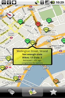
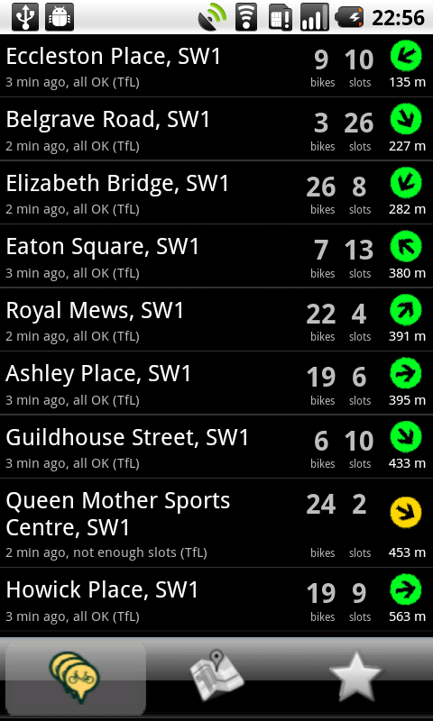
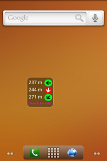
Cycle Hire Widget helps users of London's Barclays Cycle Hire project find nearby docking stations. It shows the distance, direction, and number of bikes / return slots available at each bike depot.

Originally designed only as a widget, CHW has grown into a full app. The widget remains the primary access point, while the app uses a familiar combination of list and map view to display more detailed information on each docking station.


The Deadly Sins and Glorious Virtues

Let's start by taking a look at how Cycle Hire Widget stacks up against the 5 deadly sins and glorious virtues.

Utility

The key to it's success is it's utility. Simple and effective, it solves a particular problem in an elegant way.

Arrogance and Hostility

For the most part the team have conformed to user expectations and respected system preferences. Application settings are presented using native Preference Screens, and long-pressing a docking location displays a context menu.

They've chosen to make the Preference Activity full screen (hiding the status bar) - an option I've ranted written about in the past. Similarly, the context menu has been customized to remove the familiar title bar - I'm not sure why.

In terms of usability and accessibility, trackball navigation isn't supported. We'd recommend using StateListDrawables to let users navigate the app without using the touchscreen.

Ubiquity and Generosity

The dynamic and interactive widget is a highlight of the app. Live Folders, while not as popular as widgets, could be a useful additional way to show some of the data. It might also be interesting to add a share option to the context menu for each docking station.

I'd love to see the team explore the use of notifications. The (pro version of the) app lets you select favourite depots. It would be awesome if we could monitor those favourites and notify the user if the number of available slots or bikes becomes critical.

Discrimination

The manifest explicitely supports all screen sizes, but the app still seems to be running in compatibility mode. It's important to change the targetSDK to at least 4 so that it can scale appropriately.

Because the app requests permissions for accessing the coarse and fine location, the Market infers a requirement for both WiFi and GPS hardware. Provided you're using Criteria to find suitable location providers, you can then use uses-feature nodes to specify that location services are required, but both of the specific technologies are optional.

<uses-feature android:name="android.hardware.location" android:required="true"/>
<uses-feature android:name="android.hardware.location.network" android:required="false"/>
<uses-feature android:name="android.hardware.location.gps" android:required="false"/>

Sloth and Gluttony

I can see that the Services used to update the location status is short-lived and self-terminating. If they're using inexact repeating Alarms to schedule the updates then we're golden.

The User Experience

This is a great app, and very useful, so the focus of this part of our review is to suggest some ways to add polish to the existing functionality rather than a dramatic change in functionality.

We've created a series of mockups to better illustrate our suggestions - we'll leave it to the Little Fluffy Toys team to decide which (if any!) they want to incorporate. The redesign is based on the principles laid out in Android UI Design Patterns.

We've used the Barclays Cycle Hire logo as the basis for the app's cyan, navy, and white palette.

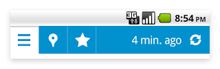
The biggest change is the addition of an Action Bar. As well as providing a consistent theme between Activities, it:
  1. Replaces the over-sized custom tab panel.
  2. Lets us refactor the "time since last refreshed" text out of each List View item.
  3. Has space for a user-initiated refresh icon that can also be used to display an indeterminate progress bar to indicate an update in progress.

On the Map Activity we've used a custom map pin that more closely resembles the standard Google Maps pin and colored it using our new color palette. A red pin indicates a shortage of bikes, a red eye indicates a lack of slots.
The summary information is now displayed in an info box at the top of the screen rather than within a custom info balloon. This same UI element is also used in the updated List View screen to highlight the nearest depot.

The List View Item layout has been optimized. We've moved the last update text to the action bar, added a toggleable "favourites" star to the left, and we've emphasized the distance over the direction. To make the list easier to parse, we're only displaying the number of bikes and slots for the nearest docking station (or if they aren't enough of either).

The current app doesn't include assets optimized for LDPI or HDPI devices. To prevent fuzzy graphics, you should always create images optimized for each category of screen res. This is especially true of the app icon.
We've used these guidelines to create a sharp icon that has the same iconography as the original, but adds depth and shading.

The current lack of menu icons makes the app's menu look half finished. In this instance they can use system defaults for all of them.

Finally, let's go back to the widget. It's the most visible representation of the app, so we spent a lot of time trying to figure out how to fit the same information in a way that better matched the current native widget style.

We didn't really succeed.

The problem is, that once you take the appropriate spacing into account there just isn't enough room for three distance / direction pairs.

Instead, we went for two designs. The first maintains the same single-cell size, but only shows a single destination. We've used the logo to add texture to the background and the navy and white color theme keeps it consistent with the app. Ideally it would be implemented so that when you add the widget to your home-screen you could choose to only show favourite depots or hide depots with no bikes (or no slots).

The second shows the three distance / direction pairs, but does so as a full width horizontal bar.

Conclusion

This surgery was a little longer than usual, but hopefully the extra detail on the user experience feedback is a helpful addition. It's up to LFT to decide which of these suggestions are worth the time and effort required to implement. What do you guys think?