Thursday, November 25, 2010

No. Sleep. 'Til Stockholm!

Ten events in seven cities across six countries in twenty-two days.

The slides for "Being Epic: Best Practices for Android Development" are on SlideShare, and you can see me presenting them at GDD Prague. I also had the pleasure of co-presenting "HTML5 of Android for Mobile Development?" with Michael Mahemoff - you can watch the video and / or check out the slides for that too.

Starting with Droidcon UK on the 28th, I spent every day of the following 3 weeks either in the air or presenting. I lost my voice at the second event (an epic all-day Android Developer Lab in Berlin), but after resting it in Florence it held up all the way until Prague (where it lasted through the keynote but started failing in the last 5 minutes of my Android presentation.)


It was a hell of a tour, filled with great events and incredible people. Starting with Yan, our host at C-Base and the man with the megaphone herding cats to successfully lead the Blinkendroid world record at GDD Munich.

From Berlin we flew down to Florence - thanks in no small part to Andrea forcefully insisting that we hold an ADL in Italy. Francesca and the Firenze GTUG then took us out to an incredible meal (featuring 4 entrees) at a wonderful tratoria before we headed out for Munich and the GDD events.

One of the most interesting aspects of doing so many events in close succession is learning what resonates best with different audiences. The best reaction I got was by imploring Czech developers not the be "Hovados". Explaining (in German) to the Munich attendees that my German was terrible, and as a result I'd be completing my presentation in English, seemed to get the crowd on-side.

Moscow is always a highlight of any GDD trip - and we got the incredibly warm welcome we've learned to expect. A special thank you goes out to the folks at Andrstore in Russia, who provided the latest addition to my plushy Android collection (pictured above).

We ended the tour at the Ice Bar in Stockholm, after Peter Svensson let us take part in a special Android themed GTUG event that was the perfect end to a long, rewarding expedition.

There will be more detailed posts on the Android Developer blog and Google Code blog, but for now I just wanted to say thank you to everyone who helped make this possible. From the GTUG organizers, to my fellow Googlers, and most of all the participants - you guys make the endless travel worthwhile. Thanks for coming out!

Time for New Material

I'm now heartily sick of my slides and it's time for some new material. So tell me, loyal Android developers, what would you like to hear more about? Let me know in the comments!

Sunday, November 07, 2010

Google Developer Day Bound

It's Autumn in Europe, and for me that means two things:
  • The view from my apartment goes from an ocean of green to a riot of reds, oranges, and yellows.
  • It's time to head to the continent for the annual Google Developer Days!
This year we're holding events in Munich, Moscow, and Prague. I'm writing this from London Heathrow while waiting for my flight to the first event in Munich, but it's actually the second leg of my November journey.

Last week I was in Berlin and Florence taking part in Android Developer Labs. This week, I'll be attending hackathons organized on the day before each of the GDD events. The highlight of these GTUG led events is the high quality developers we get to meet (the local specialities like the visit to C-Base in Berlin and the 5 course meal arranged for us in Florence are a close second.)

It's amazing to have such wonderful organizers and committed communities that let us do events like these around the world. Without them it would be impossible to organize the logistics around the 9 event marathon I'm currently a third of the way through.

You can keep track of where I'll be and what events I'll be participating in using the awesome new Google Developer Relations event tracker. If I'm going to be in a town near you, stop by and say hi!

Tuesday, October 12, 2010

Android App Surgery: Cycle Hire Widget

This week's Android App Surgery takes a look at Cycle Hire Widget from Little Fluffy Toys.

The focus of this week's review is User Experience, so to get some additional insight I've invited my colleague Roman Nurik to co-author it. Roman is passionate about good UI and is pretty handy at pushing pixels, so thanks to him this surgery includes some mockups to illustrate our ideas.

The App: Cycle Hire Widget

Cycle Hire Widget helps users of London's Barclays Cycle Hire project find nearby docking stations. It shows the distance, direction, and number of bikes / return slots available at each bike depot.

Originally designed only as a widget, CHW has grown into a full app. The widget remains the primary access point, while the app uses a familiar combination of list and map view to display more detailed information on each docking station.


The Deadly Sins and Glorious Virtues

Let's start by taking a look at how Cycle Hire Widget stacks up against the 5 deadly sins and glorious virtues.

Utility

The key to it's success is it's utility. Simple and effective, it solves a particular problem in an elegant way.

Arrogance and Hostility

For the most part the team have conformed to user expectations and respected system preferences. Application settings are presented using native Preference Screens, and long-pressing a docking location displays a context menu.

They've chosen to make the Preference Activity full screen (hiding the status bar) - an option I've ranted written about in the past. Similarly, the context menu has been customized to remove the familiar title bar - I'm not sure why.

In terms of usability and accessibility, trackball navigation isn't supported. We'd recommend using StateListDrawables to let users navigate the app without using the touchscreen.

Ubiquity and Generosity

The dynamic and interactive widget is a highlight of the app. Live Folders, while not as popular as widgets, could be a useful additional way to show some of the data. It might also be interesting to add a share option to the context menu for each docking station.

I'd love to see the team explore the use of notifications. The (pro version of the) app lets you select favourite depots. It would be awesome if we could monitor those favourites and notify the user if the number of available slots or bikes becomes critical.

Discrimination

The manifest explicitely supports all screen sizes, but the app still seems to be running in compatibility mode. It's important to change the targetSDK to at least 4 so that it can scale appropriately.

Because the app requests permissions for accessing the coarse and fine location, the Market infers a requirement for both WiFi and GPS hardware. Provided you're using Criteria to find suitable location providers, you can then use uses-feature nodes to specify that location services are required, but both of the specific technologies are optional.

<uses-feature android:name="android.hardware.location" android:required="true"/>
<uses-feature android:name="android.hardware.location.network" android:required="false"/>
<uses-feature android:name="android.hardware.location.gps" android:required="false"/>

Sloth and Gluttony

I can see that the Services used to update the location status is short-lived and self-terminating. If they're using inexact repeating Alarms to schedule the updates then we're golden.

The User Experience

This is a great app, and very useful, so the focus of this part of our review is to suggest some ways to add polish to the existing functionality rather than a dramatic change in functionality.

We've created a series of mockups to better illustrate our suggestions - we'll leave it to the Little Fluffy Toys team to decide which (if any!) they want to incorporate. The redesign is based on the principles laid out in Android UI Design Patterns.

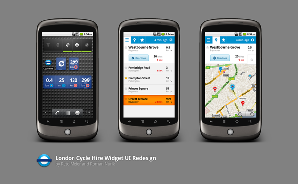
We've used the Barclays Cycle Hire logo as the basis for the app's cyan, navy, and white palette.

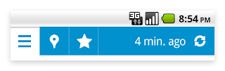
The biggest change is the addition of an Action Bar. As well as providing a consistent theme between Activities, it:
  1. Replaces the over-sized custom tab panel.
  2. Lets us refactor the "time since last refreshed" text out of each List View item.
  3. Has space for a user-initiated refresh icon that can also be used to display an indeterminate progress bar to indicate an update in progress.

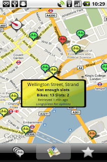
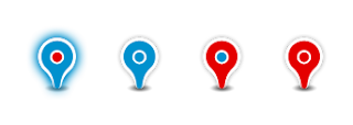
On the Map Activity we've used a custom map pin that more closely resembles the standard Google Maps pin and colored it using our new color palette. A red pin indicates a shortage of bikes, a red eye indicates a lack of slots.
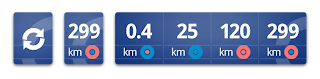
The summary information is now displayed in an info box at the top of the screen rather than within a custom info balloon. This same UI element is also used in the updated List View screen to highlight the nearest depot.

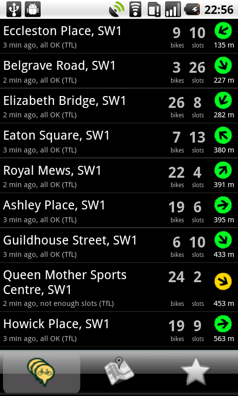
The List View Item layout has been optimized. We've moved the last update text to the action bar, added a toggleable "favourites" star to the left, and we've emphasized the distance over the direction. To make the list easier to parse, we're only displaying the number of bikes and slots for the nearest docking station (or if they aren't enough of either).

The current app doesn't include assets optimized for LDPI or HDPI devices. To prevent fuzzy graphics, you should always create images optimized for each category of screen res. This is especially true of the app icon.
We've used these guidelines to create a sharp icon that has the same iconography as the original, but adds depth and shading.

The current lack of menu icons makes the app's menu look half finished. In this instance they can use system defaults for all of them.

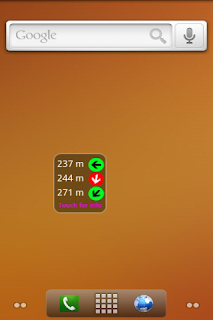
Finally, let's go back to the widget. It's the most visible representation of the app, so we spent a lot of time trying to figure out how to fit the same information in a way that better matched the current native widget style.

We didn't really succeed.

The problem is, that once you take the appropriate spacing into account there just isn't enough room for three distance / direction pairs.

Instead, we went for two designs. The first maintains the same single-cell size, but only shows a single destination. We've used the logo to add texture to the background and the navy and white color theme keeps it consistent with the app. Ideally it would be implemented so that when you add the widget to your home-screen you could choose to only show favourite depots or hide depots with no bikes (or no slots).

The second shows the three distance / direction pairs, but does so as a full width horizontal bar.

Conclusion

This surgery was a little longer than usual, but hopefully the extra detail on the user experience feedback is a helpful addition. It's up to LFT to decide which of these suggestions are worth the time and effort required to implement. What do you guys think?

Monday, September 27, 2010

What's the Point of Tablets Anyway?

A couple of weeks ago I was fortunate enough to come into possession of a Samsung Galaxy Tab. It's fair to say that I've been eager to get my hands on a PADD tablet since some time around 1987.

While the utility of a portable, touch-screen, connected device was never in question on the Enterprise, their utility in the 21st century is still being determined.

So what, exactly, are tablets good for?

The Shared Communal Device

I've already found the Galaxy Tab to be the go-to device in the living room. It's perfect for shared photo-viewing, checking actors in IMDB, and adding something to the shopping basket. The large, bright screen and long battery life make it a much better viewing experience than a mobile, and simpler and more convenient than passing around a laptop.

Modern smartphones are intensely personal. They hold more private information than most people would ever willingly share. Would you hand over your phone to a friend for 30mins? What about your wife / husband / girlfriend / boyfriend?

I've created a new shared Gmail account, specifically for my Galaxy Tab (and potentially my GoogleTV), to make it easier to share. As prices come down I see a bunch of these around the house - probably replacing laptops and TVs.

The Ultimate Gaming Device

Games on tablets look incredible. A bright, sharp screen with a ton of screen real estate work superbly with touch controlled games.

The bigger screens could have been designed specifically to support multiplayer gaming. Games like Scrabble would work great with the screen becoming the game board, but that's just the start.

I grew up playing RPGs and CCGs. Imagine playing them when everyone has a tablet. Each player would have their card deck (or character sheet) on their tablet. Another device (probably at least 10") sits in the middle of the table and displays the cards in play (or character positions on a map).

The Multi-Media Entertainment Center and eBook Reader

Back in the day, I owned an Archos 320. 20Gb of audio and video on a 2.5" drive with a 4" screen. With no SSDs in sight, moving it while playing video let you feel the torque!

Today's tablets have up to 64Gb of solid-state storage, with many also including SD card slots letting you double that. A 7", 16:10 aspect ratio screen is the perfect surface for watching movies on the move, and HDMI output will let you plug your library into your giant flat screen TV.

Add an eBook reader app and you've got one device with all you music, movies, and books. That makes for an epic entertainment center.

While you'll need to pry my hardcover books out of my cold, dead, hands - I still think that within the next 5 years, most people will access all their movies, music, pictures, and books from the cloud. When that happens tablets will be the perfect portable screen on which to consume any kind of entertainment media.

The Laptop Replacement

Is the tablet set to replace the laptop? I've noticed a few iPads in meetings as people leave their laptops behind, preferring tablets for their portable computing needs. Typing on a fast, responsive 10" touch screen is actually a workable exercise, and it's the perfect platform for presenting an impromptu slide-show pitch or showing off your app / website.

I don't see tablets replacing the laptops we use at work for tasks that require significant typing (like writing code), but the future of netbooks might have just gotten a little grim.

So what's the real deal?

My gut says tablets will become increasingly popular as shareable devices that double as personal entertainment centers. The big screen and wide viewing angle of tablets makes them less private than phones. Still personal but not inherently private.

As app developers, we are uniquely positioned to both influence, and be influenced by, how people will use these new devices, so what do you think?
  1. Communal Internet Portal
  2. Ultimate Gaming Device
  3. Multi-Media Entertainment Center and eBook Reader
  4. Laptop Replacement
  5. All of the above
Any of them sound about right or am I full of it? Let me know in the comments!

Wednesday, September 15, 2010

G-Kenya

There's something familiar about the drive from Jomo Kenyatta International in to Nairobi. The landscape of scrubland and bougainvillea reminds me of driving down Horrie Miller Drive on the way to my hometown of Perth, in Western Australia.


As we head down Mombasa Road and into the city the similarities to fade. Most striking are the birds -  gliding on the thermals, the size of small donkeys. Butterflies the size of birds complete the impression of Gulliver visiting Brobdingnag.

I didn't have the opportunity to venture outside of Nairobi, so I'm in no position to describe what it's like outside the capital - but Nairobi struck me as a city of contrasts. It was certainly chaotic, unlike many Australian and American cities that have transformed into hubs for well ordered suburbia. If you pan out from where I used to live, you'll quickly notice the grids and arterials that make up a planned, ordered city.

Nairobi isn't like that. In many ways it reminded me of organic cities like Rome and Paris - cities where you can get most of what you need by foot (and traffic bad enough to force you to do so). Along every road there's people going about their business. Walking to work, coming back from the shops, heading to see a movie. Similar to the crepes in Paris and pizza in Rome, ambulatory commuters are tempted with roasted corn-on-the-cob as well as with streetside markets overflowing with fresh fruit that tastes like fruit (note: In London fruit does not taste like fruit, it is merely fruit flavoured).

While the city's infrastructure is still some way behind that of most European capitals, there are signs of modernization. The country has a new constitution to go along with the air-conditioned malls and shiny high-rises that have started to appear. The 3G data plans are cheap and plentiful and smartphones, while still scarce, are starting to make an appearance. There's also a fat cable pipe now to provides the bandwidth vital for local technologists to participate in the Internet economy.

I was in town for G-Kenya, a 3 day Google conference aimed at sharing Google developer technologies with the student, developer, and entraupeneurial communities. If you're interested, I'll detail more about my experiences on the Android Developer Blog later this week.

Tuesday, September 07, 2010

Why You Might Want A WYSIWYG Layout Editor for Android

When I read "Why You Don't Really Want A WYSIWYG Layout Editor for Android" by my friend and colleague Roman Nurik and my initial reaction was - hmm, actually you know, I really think I might. We discussed it via email briefly, but figured you guys might enjoy reading both sides of our discussion.

Roman makes a lot of really good points - particularly on the importance of designing a coherent model for user interaction. This must not be underestimated. His ideas for UX templates sound awesome, and I totally agree that there is no silver bullet to solve the difficulties around creating great UIs.

Where we disagree is on the effect that visual layout editor could have on the quality of Android app UIs. My experience tells me that a good visual editor would have a positive effect on the quality of Android UIs, while also making it easier for beginners to get started.

Fine tuning by hand is always going to be a necessity - but getting started visually can make life a lot easier.

Visual layout editors for native platforms can make assumptions that HTML editors can't

Before joining the world of Android, I spent 10 years writing winforms apps - 5 years of Delphi followed by nearly the same of C# .NET. I've spent a lot of time with the UI tools from Borland and Microsoft.

Using web / HTML design tools to evaluate the usefulness of native layout editors is a little misleading - the reason you don't use Frontpage or Word to build webpages is because the HTML they produce is a thing born of hate - there's no reason an Android layout editor can't produce beautiful XML.

It's also worth noting that the disappearance of WYSIWYG web-dev tools coincided with the rise of Web 2.0 - when HTML made way for Javascript and CSS. I haven't seen anyone who hates themselves enough to try and create a WYSIWYG Javascript layout editor.

If we're going to compare the success and potential of visual layout editors we should be looking at native tools like Microsoft's Visual Studio and Expression Blend.

Whenever I design a new UI I start with pen and paper

Like Roman, I always start by sketching. It's the easiest way to get a feel for the the user experience workflow I'm after. This works because brain-pen-paper is the shortest path to visualizing my ideas.

Moving from pen to PC creates a barrier, but it's a price worth paying to see how my design actually works in right context.

I'm not so attuned to the Matrix that looking at XML lets me see UI, so having to turn my sketches into XML requires an additional context switch: from visual design to writing code and then back to visual layout. By using a layout designer I can continue to think visually and adapt my design without having to translate back and forth from code to images.

Witness the popularity of AppInventor

If you're not familiar with the classes and UI metaphors of a development language this context switch is brutal. You're constantly interrupting yourself by searching the docs for the name (and attributes) of the class you need.

With a visual designer you can browse the available controls and glance at their properties. The barrier to getting started and creating your first UI is significantly reduced, and your ability to experiment, test, and discover are enhanced.

It's important to remember that the built in controls are just a first step. I think of them as stencils, many of which will be replaced with better, customized solutions as the app develops. At my first job they remarked that I was "not just building the car from scratch, but engineering every nut and bolt." They seemed surprised that I took this as a compliment.

Native Visual Designers are designed for variable hardware

The size of application windows in Windows have never been fixed. WinForms layout editors are used to develop for an environment where different screen sizes are assumed. In fact your windows are expected to be dynamically resizable.

One of the beauties of WYSIWYG is that you can make changes to the presentation context and instantly see it's effect on your code. In Winforms that meant dragging your form around to make it bigger and smaller and see how your UI reacted. Having that ability in Android would be great - particularly as you can witness the changes in layout and assets as you modify the screen size and resolution without the context switching.

Users will use your app if it solves a problem. They will stay loyal if using them brings then joy

Roman suggests that "Visual layout editors arguably also place a lot of emphasis on the aesthetics". I don't think that's true. If anything, traditional WYSIWYG UI tools have done the opposite - resulting in uniformly depressing, drab UIs.

Not that this is better.

No matter what though, you are going to need to get your hands dirty in amongst the XML to get your layout right - and it's likely to be pretty early on in the process.

A rich visual layout editor is neither necessary nor sufficient to guarantee a great UI

Lazy developers will create rubbish user interfaces. If you want to use a visual designer because it's faster to drag-and-drop than to write out XML then you're doing it wrong. I believe that a good UI designer can make it easy to dynamically modify the look and feel of each component beyond being a simple drag and drop layout tool. By baking in some of the best-practices for UI development you can help codify successful UX.

Creating a compelling user experience is about more than just laying out controls on an Activity. You need to spend a lot of time thinking about what workflow you're trying to support, and how to make the user journey pleasant if not an outright joy.

Wednesday, August 25, 2010

What You Can Do With Your Modal Dialogs and Splash Screens (and the Horse They Rode In On)

Every time I'm presented with a splash screen, what I actually see is the app developer giving me the two fingered salute. The only thing more hostile is the use of a modal "loading" dialog: a UI metaphor used exclusively to save developers time at the expense of every single one of their users.
The apps which make me want to do something out of character start with a splash screen before segueing directly into a modal "loading" dialog. It's like they're spitting directly into my face. Why? Why do you hate me so much? I just want to use your app, I don't deserve this kind of hostility. No one does.

The 90s called, they'd like their UI metaphors back

Modal windows have always been a crutch. Windowed operating systems are by nature multithreaded, so to avoid apps "freezing" you execute time consuming tasks on background threads. This introduces complexity as the user can potentially interact with the UI between expected states.

The easiest solution for developers is to stick up a modal window that steals focus from the application and prevents users from interacting with the UI until the app completes the background task.

With great latency comes great responsibility

The ascent of the web as a platform largely eliminated these anachronisms. Page load times have a dramatic influence on how quickly people navigate away from a site. When page load latency is being measured in 10s or 100s of milliseconds, it's not surprising that splash screens and "loading" dialogs have all but disappeared.

The good news is that users have also gotten used to content being loaded dynamically. Most people won't bat an eyelid at a page which loads text first and updates the images afterwards. It's expected behaviour.

Users will use the time it takes getting past your splash screen uninstalling your app

It's ironic that a platform that has even less allowance for delay has seen the reintroduction of the dreaded "loading" dialog. Sadly too many devs have gotten lazy. It's harder to develop a UI that works smoothly and intuitively while data is loading or processing is being done, so many don't bother.

Don't be the lazy guy - "it's hard" isn't a valid excuse. Mobile users are incredibly impatient, phones are used on the move and users constantly switch between applications. To be successful you need to make startups and transitions fast and seamless.
  • Asynchronous tasks. Make sure anything that could take longer than a small fraction of a second happens in a background thread (use ASyncTasks to help). Use a Service to run tasks that should be completed even if the Activity is killed.
  • Branding fail. You want your app to seem an integral part of the device. Every time you show a splash screen you're reminding people that they're using an add-on -- an add-on they can replace with something less annoying.
  • Lazy loading. Loading data takes time, particularly if you need to download it first (particularly over a mobile network). It's important that you have something to show as quickly as possible, so take the browser approach by displaying what you can get quickly.  Follow that up with slower items such as images. Load additional content as required when users start scrolling down your list, taking the same approach of text first, images later.
  • In-place updates. Don't clear all your data every time you pull an update from the server. Update, add, and remove items from your UI as new data becomes available. Same with updating existing layouts with images once they've been downloaded.
  • Pre-fetching. If you've got multiple tabs or even Activities within your app, there's no reason to wait until the user changes their selection to start loading data. Pre-fetch the first page of data so that it's ready when the user switches to it.
  • Save your state. Switching between apps should be seamless and instant. Save all your Activity state so your app can resume instantly.
  • Caching. There's no reason to download the same image multiple times. Likewise, it's often better to show out of date information and update it quickly than showing nothing at all.
  • Background loading. Use Services to perform updates and download data while your app isn't in the foreground. This can extend from small amounts of pre-fetching to regular updates, or complete offline support.
  • Visual "loading" elements. Use visual elements like progress bars to indicate that you're in the process of getting an update.
  • Disable unsupported actions. Some actions within your app might not make sense until all the data is loaded. Rather than block interactivity, disable actions that aren't possible.
To see some good examples of how to present no information (or updating information) without splash screens or loading dialogs check out the Gmail and News & Weather apps. Neither use a splash screen (or loading dialogs), and both begin with no information. Once they have data, updates and changes are integrated into the existing data being displayed.


If you're creating a fully immersive experience you may have good reason to use both splash screens and loading dialogs

There's always an exception. If you're engaging in an immersive experience (like a game or turn-by-turn navigation), you don't want to start until the environment is fully constructed. Developers can't use many of the tricks above like dynamic lazy loading, because users want to enjoy the complete experience right from the start. This is especially true of 3D environments like a FPS or Google Earth that rely on an OpenGL environment.

I remember playing California Games on a friends C64. It was loaded via the tape drive, so if anyone quit the game we'd spend the 15 minutes it took to reload in a diverting game of "beat the moron". While it's important to ensure the environment is fully complete before allowing users to explore it, there are still a few tricks you can use to ensure the wait isn't quite as painful.
  • Cache any downloaded content.
  • Dynamically pre-load as much data as possible during gameplay.
  • Save and cache as much state data as possible to ensure players can resume from where they left off.
  • Try to provide useful information (hints? instructions? cut scenes?) in inter-level "loading" screens or splash screens.
  • Delay the longest pauses as long as possible. I should be able to start the game, change the settings, and navigate to "load saved game" without a significant wait.
In conclusion

For most apps, splash screens and modal loading dialogs now belong in the 1990s with 9600 baud modems and pashminas.  Embrace the now.

Tuesday, August 17, 2010

Beyond Mobiles: Android as a Universal Development Platform

Early next year GoogleTV will include the Android Market, meaning that it will be a compatible device. A GoogleTV is unlikely to include telephony support, or a camera, microphone, vibration, compass, GPS, or LED. And it likely won’t be the first Android device that isn’t a phone.

This suggests that there are some changes in store for the Android compatibility definition.

If you were an apps developer when the first desktop computer was released – what would you have built?

25 year ago, when I was writing code in my parents living room, I held little expectation that anyone but me would ever use any of it. Sharing an app meant copying it onto a 5.25” floppy disk and biking it over to a friends house where, CRC errors permitting, we’d run it.

There was also the issue of OS fragmentation. I had an IBM compatible PC-XT, my school housed a collection of BBC Micros and most of my friends had Amigas and C64s.

Over the next decade “IBM compatible” became “PC” and the Internet provided an unprecedented distribution mechanism that lets your apps span the globe in a heartbeat.

Right now there are more than 60 different compatible Android devices

Until recently the only way to get your mobile apps onto a phone was through a relationship with a carrier or device maker. Today, every day, 200,000 more people are activating Android compatible devices and searching the Market for your apps.

The open nature of Android means hardware manufacturers are using Android to power an increasingly diverse range of connected devices. At the same time, the Android Compatibility Program is expanding to make more of these devices compatible.

People talk a lot about the dangers of fragmentation

Where some might complain, I see a unique opportunity. Suddenly we’re presented with a blank slate on which to innovate, a rare opportunity to consider new ways for people to interact with devices with which they are already familiar.

If you, as a developer, want to avoid dealing with fragmentation it’s easily done. Pick a single device and develop only for that (I’d suggest the Motorola Droid). You’ll miss out on an order of magnitude of users, but you won’t have to make your apps resolution independent.

The same code will do the same thing on any compatible hardware

The Android Compatibility Program eliminates the real risks of hardware fragmentation. As a developer, all you need to do is make sure that your software doesn’t make assumptions about the underlying hardware.

So what are the assumptions you need to avoid?
  • Screen size, resolution, and aspect ratio.
  • The existence of particular hardware.
Screen size, resolution, and aspect ratio

Android developers have been accounting for different screen sizes since Android 1.6 and the release of the Verizon Droid and HTC Tattoo. There is an excellent writeup describing how to support multiple screen resolutions on the Android Developer Guide, aptly titled Supporting Multiple Screen Sizes.

At the risk of providing spoilers, it will tell you to:
  • Use density independent pixels rather than hard-coding pixel values in your code.
  • Use layouts such as Relative Layout, that don’t assume screen sizes, aspect ratios, or resolutions.
  • Provide alternative layouts (if required) for small, normal, or large screens.
  • Provide alternative drawable assets for low, medium, or high resolution displays.
  • Use the emulator to test, test, and test.
The existence of particular hardware

When it comes to hardware dependencies, there are two questions you need to address. Does your app:
  • Need any specific hardware in order to function?
  • Use some hardware features if they’re available, but which aren’t strictly necessary?
Apps like Layar aren’t very useful on a device without a camera and compass. If the answer to question one is yes, you need to create a manifest entry declaring the hardware features your app requires. The Android Market will then filter those apps out for devices that don’t have the required hardware.

  <uses-feature android:name="android.hardware.sensor.compass"/>
  <uses-feature android:name="android.hardware.camera"/>


As I described in Future Proofing Your Apps, the Market will make some aggressive guesses even if you don’t specify all the hardware you require, so if the answer to question two is yes, you need to tell the Market.

Specify optional hardware when you will use it if it’s available, but your app doesn’t depend on it.

Google Places uses cool compass arrows to show the direction of a place on interest. Even without the compass the app would still be useful on my TV, so it should declare the compass hardware as optional.

  <uses-feature android:name="android.hardware.sensor.compass"
                android:required="false" />


Within your app you will still need to find the code that uses the optional hardware and modify its behaviour accordingly.In this example, I’d want the app to simply hide the compass arrow if the compass isn’t available.

You can determine the availability of any hardware feature using the Package Manager and modify the UI or behaviour of your app accordingly.

  PackageManager pm = getPackageManager();
  pm.hasSystemFeature(PackageManager.FEATURE_SENSOR_COMPASS);


To make your life easier, all compatible devices will maintain the APIs used to monitor and control all supported hardware, they simply won’t return useful results when the required hardware doesn’t exist.

Be a launch partner for future Android devices

As an Android Advocate I’m regularly asked by developers how they can have their app available as a launch partner for future devices. You can consider this blog post as my answer.

Monday, August 09, 2010

The Future of Mobile: Invisible, connected devices with infinite screens

The history of smartphones looks something like this: At the end of 2008 the very first Android handset was available on T-Mobile in the US. The iPhone has existed for 3 years. The very first Blackberry featuring push email came out in 2002.

From WAP and push email to iPhone in 5 years. From one iPhone to 60 different Android handsets in under 3 years. At that rate it's challenging to create a credible mobile roadmap that extends as far as 6 months - and the rate of change is increasing.

At the current rate, nearly anything is possible in 20 years

Lately a lot of people have asked me what I think is the future of mobile. Some people just want to know what device they should buy at Christmas, but others are looking for a 20 year outlook. 20 years!  The first GSM network had barely launched 20 years ago! Predication at that scale is destined for failure and embarrassment. But I won't let that stop me.

Bigger screens are better

Mobile devices are morphing. Tablets have been talked about for years, and the iPad and Kindle provide the kind of experience people have been waiting for. Browsing pictures, watching videos, and reading books work really well on a screen that size.

Still, I find the iPad heavy and bulky. The ultimate device would be the size and weight of my mobile but include a screen that could be unfolded or rolled out to provide a better display for watching movies and playing games.

Actually, the ultimate device would be entirely virtual. I’d put on my glasses (or contact lenses) and look at any surface to see an augmented version of reality. Anything from interactive holographs, to augmented reality, or a cinema screen that stretches across the horizon. Everyone could see their own version of reality on a screen the size of their visual field.
1 year  High res screens, tablet devices, and HD output from mobiles.
5 years  Flexible displays and built in HD projectors.
10 years  Transparent LCD patches that can be applied to regular glasses.
20 years  Contact lenses that project a visual feed directly onto your retina.
Full keyboards are better. No keyboards is best

Keyboard designs (like the that on the SE Mini Pro) continue to improve, as do on-screen keyboards with technologies like Swype.

The Nintendo Wii and Microsoft's Kinect suggest that gestures might largely take the place of keyboards and touch screens for some interactions. Better multi-touch and increasingly accurate voice input will make physical keyboards almost entirely redundant.

For those who want to write something longer than an email, gesture recognition (capable of tracking fingers), combined with eye-focus tracking will provide virtual full-size keyboards.

If we’re thinking long-term, we can look forward to research like this letting us control our devices using our minds.
1 year  Wireless keyboards, voice input, and gestures.
5 years  Larger multitouch screens, better gesture input, and flawless voice recognition.
10 years  Full virtual keyboards and voice input eliminate physical keyboards entirely.
20 years  Mind control.
Smaller devices that last longer

The Sony Ericsson X10 Mini is a ridiculous 83x50x16mm and weighs less than 100g. When screens stop being a primary consideration for device size, the devices will shrink dramatically.

That leaves the problem of  the battery. Mobile processors will become more efficient, and fuel cells may help battery life in the short term, but ultimately we’ll be powering mobile device using biology and ambient energy. Biokinetic and ambient energy will likely be the start, but the future suggests a move away from silicon and towards biological processors. The computer you inject is more likely to resemble a specialized virus than a tiny silicon chip.
1 year  Lighter, thinner devices that last longer.
5 years  Tiny devices powered by fuel cells.
10 years  Devices small enough to embed into watches and jewellery that never need charging.
20 years  You are the computer.
Connectivity will become ubiquitous

Cloud computing is already a reality. As even more of our data and processing is done in the cloud, continual and uninterrupted Internet connectivity will become increasingly critical.

The incredible growth of smartphones in countries with a mobile data infrastructure to support them is nothing short of phenomenal. It's easy to forget that the real powerhouses of mobile phone use are developing countries - countries that don't have a reliable infrastructure for traditional "wired" Internet access. Citizens there are likely to access the Internet exclusively via their mobile phones.

Over the next decade we'll see carriers (and new challengers) aggressively rolling out faster, more reliable networks and technologies that cover larger areas across the globe.

At the same time, you'll be using your mobile to control your TV, monitor your fridge, and start your car.
1 year  3G/4G and WiFi covers most of industrial world. Every mobile device comes with an unlimited (or high-cap) data plan. Mobiles start interacting with other consumer electronics and cars.
5 years  4G/5G and WiFi extend to cover the entire developing world.
10 years  Whitespaces or similar technology means everyone everywhere is connected at all times.
20 years  Connectivity is uninterrupted and ubiquitous. Losing connectivity is like losing power or running water.
What about calls!

Apparently some people use mobile phones to make and receive calls(!) As devices get smaller, keyboards become virtual, and screens move closer to your eyes, you'll need a separate piece of kit to sit near your mouth and ears. Bluetooth headsets will get smaller and more discrete, people apparently talking to themselves in public will become no less creepy or annoying.

Infinity screens, invisible devices, always connected

In 2030 you'll think of smart-phones as quaint anachronisms that died out about 10 years ago, now that all computing is mobile. You’ll be constantly connected to the Internet by a virus that lives in your bloodstream. Contact lenses will provide a truly infinite screen, and you’ll interact with your augmented environment through a combination of mental commands, physical gestures, and voice input.

We'll take all this for granted and complain that we still don't have jetpacks or flying cars.

Wednesday, July 28, 2010

How to Display the Android Status Bar in Full Screen Apps

Uninstall them. It's the only way they'll learn.

Of course to be constructive, you should also leave a comment that explains how much you dislike it when an app presumes to be the most important thing on your phone.

Let's talk about user experience best practices

If my talk on Best Practices at Google I/O and Roman's OSCON session on Android UI design tips weren't enough of a hint, let me spell it out - improving the user experience of Android Apps is a big priority for many of us in Android Developer Relations.

I've already talked about the use of exit buttons, and the next time the fires of hate are stoked to a white heat I'll harness the power of my fury to tell you how I feel about modal loading dialogs and splash screens.

Do not presume to know how I use my phone

One of the deadly sins from my I/O session was hostility. A hostile app is one that tries to force me to change how I use my device.  I use the status bar a lot, so hiding it instantly gets my hackles up. I use the status bar to:
  • Switch between apps. If I had to choose between the app launcher and the status bar, I'd choose the status bar. It's how I switch to most apps.
  • Determine connectivity. I live in London, commute on the underground, and most apps are Internet connected. This is a tricky combination. Knowing if (and how) I'm connected to the Internet affects what apps I use and how I use them.
  • Tell the time. Ok, so I also wear a watch - but if I'm already looking at my phone why make we look away to my wrist?
  • Be event driven. I treat incoming messages (email, SMS, Twitter) as hardware interrupts. Any app that hides that from me is going to have a short lifespan on my phone.
  • Listen to music. Good music apps have an ongoing notification that can be used to control playback.
Every pixels of screen real-estate on a 3.5" display is valuable, so I understand the temptation to reclaim each and every one for your user interface. Doing so, however, can be incredibly hostile.

Some excellent exceptions

Now before you start flaming me in the comments, I'd like to point out that there's a good reason the ability to hide the status bar exists. Hiding the status bar is vital if you want to allow your users to be fully immersed in your app.

But what's immersive enough? Consider going fullscreen to be equivalent to disabling incoming calls.

In the following examples going full screen is not only acceptable - it's preferable (if not necessary):
  • Immersive games. Games into which you place yourself (particular 1st person racers or shooters) are a great example.
  • eLearning. The brain is a machine with limited short term memory. Studies have shown that successful learning requires focus, so notifications and alerts will actively prevent you from learning effectively.
  • Watching Video. A full audio / visual experience. 
The following examples fail this test:
  • Casual games. Casual games are designed to require minimal concentration and are often used while waiting for something else to happen. Interruptions, while not welcome, are inevitable.
  • Just about every other app. I've seen List View apps that go full screen, apps that switch to full screen view only for the settings screens, and full screen splash screens. Please. Just. Stop.
In most cases it seems the developers figured "why not?"

If you're changing default behavour, the question should always be "why?".

A good app has as little friction as possible - it quickly becomes a part of your phone that you'd miss if it were gone. The easiest way to reduce that friction is to behave in a manner consistent with other apps, and complimentary to existing user habits.

Tuesday, July 20, 2010

Mobile App Analytics (or how I stopped guessing and started measuring)

The only things as important as figuring out your app's user journey and the resulting user experience are prioritizing the list of features and deciding where best to allocate your development resources. Unfortunately, it's hard to get this right the first time as the judgements are subjective and based on how you think users will use your app.

Listen to your customers

There are many ways to get feedback from app users.  Most telling (though least instructive) are your active installs - people seldom uninstall apps they use and like. This is supported by Market feedback ("Earthquake!" has over 1600 comments and 1700 ratings to go with regular emails sent to the support address published in the market).

This feedback is invaluable but, as Chris Pruett noted when reviewing feedback for the excellent "Replica Island", user feedback can be unreliable.

Mobile app analytics packages like Google Analytics for Mobile Applications or Flurry let you measure how users actually use your app to help you make objective decisions on where to focus your attention.

I recently added Google Analytics for Mobile Applications to Earthquake

It's a fairly simple process consisting of adding a dummy site to my analytics account (from which to obtain a tracking ID), downloading the Analytics JAR file, sticking it into my project's /lib folder and adding it to the build path (full instructions here).

Within my app I simply get an instance of the tracker:

myTracker = GoogleAnalyticsTracker.getInstance();

Start tracking:

tracker.start("UA-MY_CODE-XX", this);

And add a page hit for every event I wish to track:

EApplication.getInstance().getTracker().trackPageView("/map_view");

All the hits are stored in an SQL database, so you can batch the updates and dispatch them the next time your app accesses the Internet. I do it every time I update the earthquake feed:

EApplication.getInstance().getTracker().dispatch();

The page names you're tracking are totally arbitrary - letting you create a new page for every action you want to track.

This is relevant to my interests

There are three general categories of data I can analyze:
  • User demographics. I can track the geographic locations (and language settings) of my users and the speed of their connections. I can also track their screen resolutions and if they're viewing the app in landscape or portrait modes.
  • App usage patterns. The real value comes from finding out how people used the app. What options did they enable? Which Activities do they spend most time on? Which menu options were selected? Did anyone long press anything? Did they add the widget? In short: How does their usage confirm or contradict the assumptions I made in the design?
  • Exception tracking. I also tracked every caught exception. Now I can find out which unexpected edge cases are occurring regularly, and try to figure out why.
My Findings
  • My users are based predominantly in coastal areas near fault-lines. Los Angeles, San Francisco account for nearly 25% of my active user-base (with LA nearly half of that).
  • English accounts for 85% of my user-base. Followed by German, Japanese, and Spanish.
  • Less than 2% of my users have small screens.
  • The Map View is only marginally more popular than the List View (52% vs 48%).
  • Less than 10% of my users view the app in landscape mode.
  • 4% of users switch the map type. Of those, the average is to switch it twice - suggesting my default selection is the preferred viewing mode.
  • 4% of users center the map to their current position. Very few people do it more than once.
  • Of the users who have long-pressed an earthquake in the List View, almost none do it more than once.
  • 7% of users install the widget.
  • 0.1% of users use the Live Folder.
  • The average number of refreshes is one every 3hrs. The default is once per hour.
  • 10% of users manually refresh the earthquake list, but most do so only once.
  • The app is throwing exceptions when parsing the incoming earthquake feed for 20% of users. Those users are seeing an average of 6 exceptions daily each (approximately equal to the typical number of daily refreshes). There doesn't appear to be a connection between these failures and the user's country, network, or device (pivoting on the error page against these categories reveals similar proportions to overall users). 
My new priorities
  • I need to track down the cause of those exceptions!
  • It's probably not worth creating an optimized display specifically for small screens or landscape viewing.
  • I should consider advertising the Widget within the app.
  • If I choose to localize I should prioritize German, Japanese, and Spanish.
  • Both List View and Map View seem equally popular - this is counter to an assumption I made on likely user preference.
  • Most users are refreshing less often than the default, and very few people are regularly manually refreshing. Without a distribution, the average isn't particularly helpful in figuring out if the options need changing.
  • The menu options aren't being used. Perhaps I should try moving the most popular one to the main UI to see if discoverability is affecting use.
Conclusions

In truth I've probably performed this analysis a little early. To do a more thorough study it would be smart to collect a couple of weeks of data.

I'm now all set to perform A/B testing on future releases. By tracking a unique version number page within each release I can use Analytics' pivot functionality to track changes in behavior, demographics, and exceptions based on the changes I make for each release.

I also discovered some gaps in my tracking that need to be added to the next release: 
  • How many people click an earthquake to view it on the map.
  • Exactly which exceptions are being triggered in the parsing routine.
  • I need to add extra tracking to figure out the distribution of update frequencies.

Monday, June 14, 2010

World Cup Recipe Apps for Good from Hungary

Over the last couple of weeks I've used Twitter to ask for user recommendations on Hungarian, Recipe, and World Cup apps. It seemed unfair to keep the results to myself.

I also recently had the pleasure of working with a Apps for Good, a program from CDI Europe that teaches young people how to create apps that change the world - a philosophy I could not possibly agree with more. The class I was involved with recently graduated, and published 3 new apps to the Android Market in the process.

So, for your enjoyment (and with limited commentary) here are some of the apps I've been checking out recently.

Apps for Good
  • Stop and Search: Really useful reference app that walks you through your rights and obligations when you're stopped by the police in the UK. Bonus points for providing a mechanism for rating and mapping the experience, as well as viewing a map of other reported stops.
  • StudioPhly: For aspiring musicians, this app will let you find a local recording studio with the gear you need.
  • StudentVoice: Lets prospective students find out more about the prospective Universities.
Some Hungarian Apps
  • Ball Madness (by A-Droid): A satisfyingly difficult bouncing ball puzzle game. Recommended despite my difficulty in getting past level 3 :(
  • VibraSeq (by A-Droid): Love this. A sequencer to create complex device vibration patterns. But wait! You can export the recorded vibration patters for use in 3rd party apps that support them.
  • Names (by Elek, Márton): Simple widget that tells you what Hungarian name day it is. Bonus points for searching your contacts and triggering notifications to remind you of anyone's name day.
  • GPS Status (by EclipSim): There's a few apps out there that will show you the position, strength, and details from the GPS - but from what I've seen this is the best of them. Nice UI, lots of information, perfect for the data obsessives amongst us.
Recipe Apps
  • Cooking Capsules (by Smart Capsules): Recipes + shopping list + video of the recipe being made. An ADC1 winner, it's an oldie but a very goodie.
  • Epicurious (by Condé Nast Digital): This seemed a popular choice, and with 28,000 recipes I can see why.
World Cup Apps
  • Goal.com Mobile (by Handmark): Live scores, breaking news, good stuff.
  • World Cup News Pro (by Mippin): All the World Cup news for all the teams you follow, presented in Mippin's familiar flip-card UI.
  • Sun Football (by News International): Live scores, highlight videos, and world cup news from The Sun newspaper.

Wednesday, June 02, 2010

Google I/O Session Videos Available Now!

I had the honour of presenting the first Android session of Google I/O 2010, and it was clear very early on that Android was going to be a popular topic.

The room started filling about half-way through the day one keynote. By the time David Glazer was wrapping up, there were no empty seats. By the time I got started there were around 1,000 people packed into the 700 seat session room and the fire marshal had shut (and guarded!) the doors to stop anyone else from joining us.

A Beginner's Guide to Android

I was supposed to present "A Beginner's Guide to Android". I chose to interpret this title liberally, and quickly segued into "Android Best Practices for Beginners".


If you want to play along at home, you can download the slides.

Regular readers should recognize many of these tips as being remarkably similar to the suggestions I make during my Android App Surgeries.

Standing Room Only SOLD OUT!

The door guards never left. With people setting up camp once they found a seat, there were times when speakers found it difficult to gain entrance. With people locked out of each session, it's great that the video and slides for all the Android I/O sessions are now available.


There were some really great Android presentations this year. During my session I called out Justin's "Casting a wide net: how to target all Android devices", and "Android UI Design Patterns". Personally, I'm keen to find out more about the Android Cloud to Device Messaging Service and pick up some tips on building faster Android apps.

The Other, Other Sessions

All the I/O session videos will be made available over the next week or two.

As well as Android, you can already see the sessions for App Engine, GWT, and Enterprise. Chrome, Social, Geo, and Wave will all be available by next Monday.

What's in a Word?

There's some interesting discussion on ModeratorBuzz, Twitter, and in the comments of my last post asking you guys to tell me what you mean when you say "fragmentation".

My theory (stolen shamelessly from Dan Morrill) is that the term has been overloaded to the point of uselessness. The aim of my previous post is to unwrap the (genuine) concerns hidden within this term to allow us to discuss them without dissolving into an argument over the semantic meaning of one word.

I'm going to let the discussion continue for a while but I'll definitely respond to some of the most prominent / popular(?) issues soon. In the meantime I wanted to highlight some tweets I got from NinjaCyborg on Twitter.

He raises some interesting points, which I'll respond to, but I wouldn't have considered any of them to be good examples of fragmentation. For the most part you could happily substitute "openness" or "annoying" depending on your point of view:
  • Fragmentation is launching apps that only run on the new OS release when the previous one barely had a 6 month lifecycle.
  • Fragmentation is allowing licensees to ship hardware that isn't powerful enough to run your OS and makes web apps crawl
  • Fragmentation is changing the browser location API in between 1.6 and 2.0
  • Fragmentation is not including basic APIs for things like Bluetooth OBEX so we have to hit the hardware. OBEX is a basic, fundamental part of Bluetooth. Not complying with the standards == fragmentation
  • Fragmentation is pretending most Android users are on 2.1+ when there are still phones being sold on 1.5 and 1.6 with no upgrade
  • Fragmentation is letting your licensees choose whether to have browser chrome or fullscreen browsing
That doesn't make his questions any less valid, but it does demonstrate just how overloaded the term "fragmentation" is.

[To make keeping track easier, comments for this post are closed. Please use Moderator or the comments from the previous blog post to continue the discussion]

What Do YOU Think Fragmentation is?

Dan Morrill, Google open source & compatibility program manager extraordinaire, wrote a great post on compatibility on the Android Developer Blog yesterday. It explains - in some detail - why device and platform variety is a good thing for developers, and what the Android team are doing to make sure it stays that way.

Within the post, Dan makes what some might consider a bold claim:
Because [fragmentation] means everything, it actually means nothing, so the term is useless. Stories on “fragmentation” are dramatic and they drive traffic to pundits’ blogs, but they have little to do with reality. “Fragmentation” is a bogeyman, a red herring, a story you tell to frighten junior developers. Yawn.
If that pull quote makes you angry, I strongly suggest you go ahead and read the full article. Seriously. I'll wait.

By reading it you'll learn all about the Compatibility Definition Document [PDF] and how the Android Market and Compatibility Test Suite are used to ensure that the apps you write will work consistently across all compatible devices.

As an apps developer, Dan addresses my concerns completely. As long as there's a process in place to ensure I only need to write one app, launch it in one place, and know that it will behave as expected on any device for which it's available, I'm happy.

Judging from some of the abuse I get when I link to the updated platform distribution graph, or urge developers to start using new APIs when we release a new SDK, it seems some people have Strong Opinions on the matter. So, if having read Dan's explanation, you're still angry (or angrier still), I'd be interested in finding out why.

As Dan says, fragmentation has been used as a catch-all for "things that are different", making it impossible to have a meaningful conversation around any of the individual topics. I've created this Moderator page to find out what YOU think is a "fragmentation" problem on Android -- and more importantly why you think this does / could cause issues for developers -- hopefully while avoiding an argument over what "fragmentation" is or isn't.

Tuesday, June 01, 2010

Android App Surgery: Simple GPS

This review is part of my series of Android App Surgeries, you can vote for which app I should review next, or nominate your own app for review on the Android App Surgery Moderator page.
I've spent the last couple of weeks preparing for, rehearsing, and presenting at Google I/O. As a result, I skipped last week's App Surgery.

I'm going to ease back into things this week by taking a look at a very simple app: Simple GPS Info. It's a simple app that displays some additional information from the GPS - including the relative position of the satellites being used to triangulate your position, and the latest GPS fix accuracy.

Once you've been found, the app then lets you share that location.

Next week I'd like to tackle something a little juicier, so be sure to nominate your own app, or vote for something substantive on the Moderator site.

User Experience

The primary user experience for Simple GPS requires no user interaction. You launch the app, wait for it to get a GPS fix, and then observe the results. With limited user interaction it's particularly important that you find effective ways to engage the user and keep their attention.

GPS Status starts off well by keeping things simple. The screen is (relatively) uncluttered with the data displayed clearly and intuitively without any unnecessary distraction.


Generally speaking, there's too much blank space. The text could be bigger, as could the compass dial - there's no reason a third of the screen should always be blank. With no user interaction the data is the only thing engaging the user, so it needs to really stand out.

On the plus side, the latitude, longitude, and accuracy return values are all of predictable fixed length, so it should be easy to optimize the UI to make the data as visible as possible.

There are some specific UI choices that I think detract from the apps usability:
  • The app has hidden the standard title bar, and replaced it with a custom version. Generally users prefer familiarity, so given that the replacement bar offers no additional functionality I would avoid replacing it. 
  • Getting a GPS position fix can often take longer than your screen timeout, and with no user interaction you risk the device going on standby before your location is found. It's worth considering asking the Window Manager to hold a WakeLock until the first GPS position is found. Thereafter it would be a useful menu option for people who want to monitor changes.
  • It would also be good to know how far along we are at getting a lock. Perhaps show an overall signal strength that gives and indication of how many more satellites are needed before a result will be available?
  • Scientifically speaking, precision and accuracy are different things, GPS result quality is usually related as a measure of accuracy. 
  • Landscape mode has been disabled. As an alternative, I'd consider creating a different layout optimized for landscape orientation.
It would also be great to color-code the satellites, green if they were used to calculate the last position, red otherwise.

The one area of interaction is around sharing your current position. It's a pretty good idea, but the implementation could do with some more polish:
  • The share button looks out of place. I'd consider moving it into an Activity menu rather than cluttering the screen.
  • If you try to share a position before a GPS lock has been found, the toast displayed has a number of spelling and grammatical errors that make the app look significantly less polished.
  • Using a URL shortener adds a dependence on an Internet connection that isn't strictly needed. Currently the app fails if no Internet connection is found - perhaps a better alternative would be to fallback to the full-length URL?
  • The shared position page is hosted on a private domain. This is great for allowing customization of the data being shared, but it might put some heavy load on your servers! I'd consider making the sharing data more generic. Using the Google Static Maps API you can create a pretty good custom map-based landing page.
    Android Features

    I briefly considered suggesting a Live Wallpaper or Widget, but the power implications of such a thing would quickly make it untenable.

    Instead, I'd like to suggest use of the Reverse Geocoding Maps API. Using this API you could find the street address of your current location, adding additional context (and engagement) to the app, as well as additional information to "share".

    Stability / Performance / Risk

    Stability-wise -- no crashes, no failures.

    I did notice one possible issue. If you launch the app with the GPS disabled, it prompts you to allow it to force it back on.

    1. It's bad form to modify settings like this directly. It would be better if it displayed a message (similar to Market with background data disabled) suggesting that you can't use the app without GPS and offering a link to the appropriate settings page.
    2. If you say yes, then exit the application and disable the GPS, reentering the app doesn't prompt you to re-enable the GPS.
    Get Your App Reviewed!

    If you'd like to see your app reviewed, you can self-nominate at the moderator site. You can also go there to vote for which app you'd like to see reviewed.